
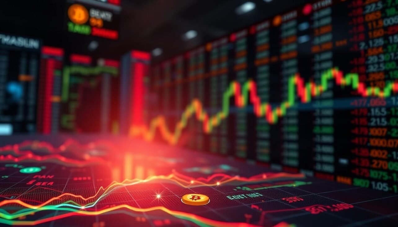
Navigating the fast-paced digital asset market requires sharp tools. A heatmap is one such essential visualization tool. It transforms complex data into an intuitive, color-coded display.
These powerful charts serve as dynamic information delivery systems. They reveal hidden market dynamics and liquidity concentrations that traditional price charts often miss.
For traders, this visual format enables faster, more informed decisions. It helps identify opportunity zones and understand where other participants are active. Spotting patterns becomes immediate.
Different types exist, like market depth and liquidation heatmaps. Each provides unique insights into trading activity and risk. For a deeper dive, check out our guide on the crypto heat map explained.
Mastering this skill gives traders a competitive edge in any market condition. It’s about seeing the story behind the numbers.
Understanding Crypto Exchange Heat Maps
These dynamic charts serve as a window into the market‘s underlying liquidity structure. They translate raw numbers into an accessible visual representation. This heatmap tool simplifies complex order book dynamics.
Definition and Purpose
A heatmap is a color-coded display of buy and sell orders across price levels. Warmer colors show areas of high activity, while cooler shades indicate thinner zones.

Its primary purpose is to reveal where liquidity concentrates. This information helps traders see the actual forces behind market movements. It highlights key price areas with dense orders.
Key Benefits for Traders
Traders gain clarity on order flow behavior. They can spot where large participants place their positions. This visual representation speeds up decision-making.
Identifying high-probability zones becomes intuitive. The data grounds choices in observable market data. Emotional trading is reduced.
Ultimately, a heatmap provides transparency into the market‘s microstructure. It turns complex information into actionable insight.
How to Read Crypto Exchange Heat Maps
Deciphering a heatmap starts with grasping its basic layout and visual coding. The horizontal axis displays price levels, while the vertical axis shows activity intensity. Color intensity is the primary signal—bright yellows and reds mark high-concentration areas.

Focus on dense color clusters for identifying key liquidity zones. These areas represent psychological points where many orders gather. Bright zones above the current price suggest sell-side resistance, while those below indicate buy-side support.
Track how these clusters move over time. Shifts signal that traders are repositioning. Observe price behavior when it touches these heavy color zones. A bounce or breakout confirms their importance.
Combine this visual data with other tools like volume indicators or RSI. This creates a comprehensive market picture. The heatmap shows where liquidity sits and predicts potential reaction levels.
Analyzing Market Liquidity and Order Flow
Liquidity zones on a heatmap act as magnets, attracting price action and revealing key support and resistance levels. This tool displays true, non-aggregated market depth data. You see what other participants are doing in real time.
The right side shows the current order book. The left side is a historical, color-coded record. This allows for dynamic analysis of order flow over time.
Interpreting Color Codes and Intensity
Color intensity is your primary guide. Bright horizontal zones represent dense clusters of limit orders. Warmer colors signal higher activity and liquidity at specific price levels.
Volume bubbles add another layer. Green bubbles show aggressive market orders consuming sell-side liquidity. Red bubbles indicate sell activity absorbing buy-side depth. This reveals the balance of power.
Spotting High Liquidity Zones
Identify these areas by scanning for the brightest, thickest bands. They form where large numbers of orders accumulate. These zones often act as price magnets.
When the market approaches, price tends to gravitate toward or react strongly at these levels. Observing order flow here shows whether liquidity is being taken or holding firm.
Comparing Heatmaps to Traditional Price Charts
While candlestick charts document historical price action, a newer visualization reveals the forces that create it. This represents a major shift in trading analysis.
Advantages Over Candlestick Charts
Candlesticks show open, close, high, and low prices for a set time. They are excellent for spotting historical patterns. However, they only display the consequence of market activity, not the cause.
A heatmap provides different information. It visualizes the limit orders in the book. This shows the actual determinants of price, offering a forward-looking perspective.
Traders see where liquidity sits right now. This allows for anticipating moves instead of reacting to them. For the most comprehensive view, combine this data with traditional methods to analyze crypto charts effectively.
Exploring Bitcoin Liquidation Maps and Their Impact
Bitcoin liquidation maps reveal hidden structural vulnerabilities within leveraged markets. These specialized tools display where forced selling or buying is likely to occur.
They visualize critical price levels where exchanges automatically close positions. This happens when traders using borrowed funds can no longer cover losses.
Understanding Liquidation Zones
Bright yellow or red zones on the map signal high concentrations of risk. Cooler blue or green areas show levels with minimal exposure.
Clusters above the current bitcoin price represent long positions at risk. Zones below indicate vulnerable short bets. This market data is essential for informed trading.
Magnet Zones and Volatility Indicators
These dense liquidation zones act as powerful magnets for prices. Algorithmic players often drive the market toward them to trigger cascading orders.
The resulting forced closures create predictable volatility. Dense clusters signal a high probability of sudden price acceleration. Savvy traders use this to anticipate and navigate volatility spikes.
Utilizing Real-Time Data and Market Trends
The fusion of high-speed data processing and human pattern recognition creates a powerful edge for traders. Modern market analysis demands tools that deliver insights as events unfold.
Insights from High-Frequency Trading
High-frequency trading algorithms execute in milliseconds. They create distinct behavior patterns within the order book. Large players often split orders to mask their activity.
This creates noise for machines. The human eye, aided by a dynamic heatmap, can spot these coordinated footprints instantly. This visualization reveals the true story behind the data.
Integrating AI and Machine Learning Signals
Artificial intelligence processes millions of data points per second. Machine learning models identify recurring liquidity formations. They flag statistical anomalies and potential opportunities.
These signals provide a layer of quantitative information. Human traders add crucial context and strategic interpretation. Together, they form a complete market picture.
Real-time data streams reveal directional biases early. Growing support or resistance clusters signal emerging trends before traditional charts. This advance notice improves entry and exit timeing significantly.
Visualizing Liquidity: Tools and Platforms
Effective liquidity visualization demands dedicated tools built for order book analysis. Professional platforms meet this need, transforming raw market data into actionable intelligence. Bookmap stands out as a leading solution for this specific task.
Overview of Bookmap Features
This platform delivers a color-coded heatmap display of market depth over time. It shows where large limit orders sit and how they shift. Traders gain pixel-level precision with true, non-aggregated data.
Key features distinguish passive liquidity from aggressive volume. Signature volume bubbles appear at execution points, showing buy or sell dominance. Unlimited zoom allows analysis from broad views down to micro-second detail.
Historical replay and broker integrations support both study and live trading. Customization options let users tailor the visualization for clarity. These tools provide a complete view of the order book’s microstructure.
Implementing Heatmaps in Your Trading Strategy
Strategic traders leverage heatmap insights to time entries and manage risk. This visual tool transforms complex order book data into a clear action plan. It grounds every decision in visible market structure.
Timing Entry and Exit Points
Identify high-probability zones where price often finds support or resistance. Wait for the market to approach these dense liquidity clusters. This patience prevents chasing moves at arbitrary levels.
For exits, spot opposing liquidity concentrations. A long trade might target profit just before major sell-side zones. Liquidation clusters often create natural profit-taking points as forced orders trigger reversals.
Risk Management and Stop-Loss Placement
Avoid placing stops inside high-density liquidation zones. These areas experience explosive volatility that can wipe out positions prematurely. This is a common and costly error.
Set protective stops just beyond significant liquidity clusters. This placement allows a trade to withstand likely volatility spikes. Always combine heatmap signals with other indicators like RSI for stronger confirmation.
This integrated approach creates a robust framework for any market condition. It turns visual data into disciplined, profitable execution.
Overcoming Common Mistakes When Using Heatmaps
Even experienced traders can stumble when interpreting visual market data. These powerful heatmaps are not crystal balls. Their effectiveness depends on proper use and avoiding key pitfalls.
Misinterpreting Color Intensities
A bright color zone indicates high concentration, not a guaranteed outcome. Many traders wrongly treat every yellow cluster as a surefire trading signal. This overconfidence leads to poor entries.
Remember, signals from a heatmap show probability, not certainty. External news can override microstructure patterns. Always seek confirmation from other market information.
Avoiding Outdated Data Pitfalls
Liquidity and positions change constantly. Relying on stale data is a dangerous error. What was relevant an hour ago may now be meaningless.
Refresh your heatmaps frequently. Make decisions based on the most current data stream. This prevents targeting phantom zones that no longer exist.
Combine this visual tool with traditional analysis for the best results. This creates a robust, multi-layered view of the market.
Advanced Analysis: Combining Heatmaps with Technical Indicators
Isolating any one indicator creates blind spots. Comprehensive market analysis requires weaving together structure, momentum, and volume. A heatmap shows where liquidity sits but should never be the sole signal for decisions.
Integrating RSI, Volume, and Trend Lines
Pair a heatmap with the Relative Strength Index (RSI). When price movements approach a major liquidity zone, check for RSI divergence. This powerful confirmation often signals a high-probability reversal point.
Volume analysis validates these tests. High volume at a support level indicates genuine buying interest. Low activity suggests the zone may not hold.
Traditional support and resistance levels gain immense weight when they align with visible liquidity clusters. These convergence points represent consensus. For a deeper understanding of these foundational patterns, study classic chart patterns.
This multi-layered approach addresses each tool’s limits. It creates a robust framework for anticipating market behavior.
Conclusion
The true value of visual market tools lies in their power to reveal collective behavior. A bitcoin heatmap offers a transparent window into liquidity and sentiment. It answers critical questions about support, resistance, and participant positions.
Understanding the underlying data is crucial. Do not just react to color changes. This information transforms speculation into informed analysis.
These visualization platforms will evolve, adding on-chain metrics. Both institutional and retail traders gain better execution and clarity. Strategic trade decisions stem from this deeper insight.
Mastering this skill provides a competitive edge in dynamic markets. It combines data intelligence with disciplined execution for long-term success. This approach positions traders advantageously relative to other players.
FAQ
What is the main purpose of a trading heatmap?
A trading heatmap provides a visual representation of market data, showing buy and sell order activity across different price levels. Its primary purpose is to reveal liquidity zones and market sentiment, helping traders identify potential support and resistance areas where significant trading activity is concentrated.
How do color codes on a liquidity map help in analysis?
Color codes and their intensity indicate the volume of orders at specific prices. Typically, red hues show sell order clusters, while blues represent buy order interest. The deeper the color, the higher the order volume, allowing for quick visual identification of key market behavior and potential price magnets.
Why are heatmaps considered superior to candlestick charts for some analysis?
While candlestick charts show past price action, heatmaps display real-time order book data and pending limit orders. This visualization offers a forward-looking view into market depth, showing where large players have placed their orders, which can signal future price movements and volatility before they appear on a traditional chart.
What are liquidation zones on a Bitcoin heatmap?
Liquidation zones are price areas where a high concentration of leveraged positions are likely to be forced closed. On a heatmap, these appear as significant clusters of stop-loss or margin call orders. Identifying these zones helps traders anticipate potential spikes in volatility or rapid price movements as the market “hunts” for this liquidity.
How can traders integrate heatmap signals with other technical tools?
For robust analysis, combine heatmap data with indicators like RSI, volume profiles, and trend lines. For instance, a strong support zone on the heatmap aligning with an oversold RSI reading and high historical volume creates a more powerful confluence for a potential long entry, improving trade timing and risk management.
What is a common mistake when first using these visualization tools?
A frequent error is misinterpreting color intensity without considering context. A deep red zone might not always indicate strong resistance; it could represent a large sell wall being absorbed. Traders must analyze the dynamic flow of orders over time, not just static snapshots, to avoid acting on outdated or misleading data.
Which platforms offer advanced heatmap features for serious traders?
Platforms like Bookmap are industry leaders, providing high-definition visualizations of market liquidity and order flow. These professional tools aggregate data from multiple exchanges, offer real-time rendering of market activity, and include features for tracking large orders and predicting short-term price movements based on order book dynamics.
No comments yet