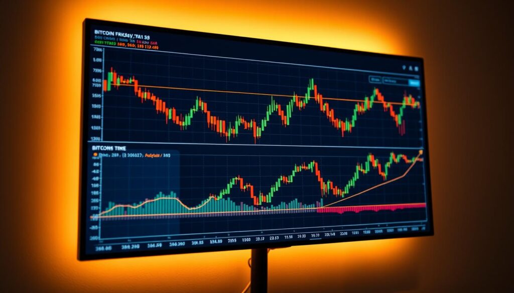
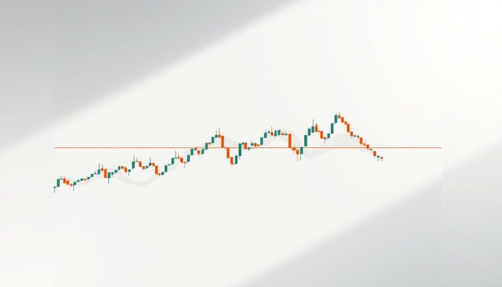
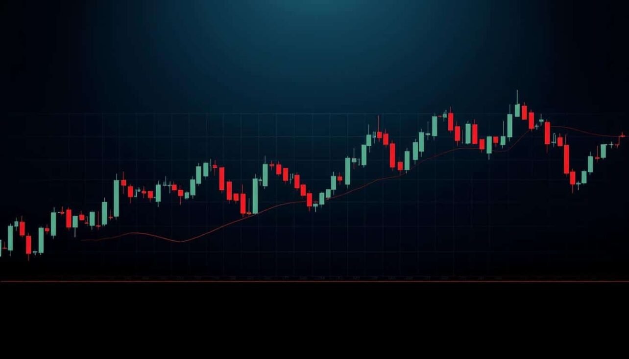
Visual charting techniques rooted in 18th-century Japanese commerce now power modern digital asset strategies. Originally created by rice merchant Honma Munehisa, these methods evolved into today’s widely used price-tracking systems. Their simplicity in displaying market psychology makes them invaluable for decoding volatile environments.
Contemporary investors apply these time-tested approaches to navigate crypto’s rapid fluctuations. Each visual pattern tells a story about supply, demand, and trader emotions. When combined with modern metrics, they form a robust framework for decision-making.
The fusion of historical wisdom and current tools helps traders spot opportunities others might miss. This approach removes guesswork by focusing on concrete data rather than speculation. Regular practice with these methods builds confidence in interpreting complex market signals.
Key Takeaways
- Chart analysis originated from 1700s Japanese rice markets
- Visual patterns reveal trader psychology and price trends
- Combining classic methods with modern metrics enhances accuracy
- Historical success in traditional markets validates crypto applications
- Systematic approaches reduce emotional decision-making
- Clear frameworks help identify entry/exit points
Understanding the Basics of Bitcoin Candlestick Charts
Financial markets speak through visual language, and candlestick charts translate price action into actionable insights. These tools capture four critical price points for any timeframe: where trading began, ended, peaked, and bottomed out. This clarity helps traders decode market behavior without guesswork.

What Are Candlestick Patterns?
Each candlestick tells a complete story of market activity. The body shows opening and closing prices, colored to indicate upward or downward momentum. Thin lines above and below—called wicks—reveal the session’s price extremes.
Patterns form when multiple candlesticks arrange into recognizable shapes. A series of tall green bodies might signal strong buying pressure, while long upper wicks could show failed attempts to push prices higher. These formations help predict shifts in supply and demand.
Key Price Points: Open, Close, High, and Low
The opening price sets the stage for each trading session. As activity unfolds, the price fluctuates between its highest and lowest points before settling at the closing value. Together, these four metrics create a snapshot of market sentiment.
Real-time charts update these metrics continuously, letting traders spot trends as they develop. Shorter timeframes like hourly charts reveal intraday volatility, while weekly views highlight broader momentum. This flexibility makes candlestick analysis adaptable to various strategies.
By mastering these components, traders gain a structured way to interpret chaotic markets. The relationship between opening and closing prices often hints at who’s controlling the market—bulls or bears—while wicks expose price rejection levels.
Breaking Down the Components of a Candlestick
Decoding market behavior starts with understanding candlestick structures. Each element acts like a fingerprint, revealing how buyers and sellers interacted during a specific period. These visual tools transform raw numbers into clear narratives about momentum shifts and potential turning points.

The Role of the Candle Body and Wicks
The thick central portion—called the body—shows the battle between opening and closing prices. Green bodies mean prices rose, with the bottom marking where trading began and the top showing where it ended. Red bodies flip this relationship, indicating downward pressure.
Thin lines extending from the body (wicks) map extreme price swings. Long upper wicks suggest failed attempts to push values higher, while lengthy lower wicks reveal rejected dips. These shadows help traders spot support and resistance levels that might influence future moves.
Identifying Bullish and Bearish Patterns
Color and body size offer instant clues about market control. Extended green candles signal strong buying interest, while tall red ones show intense selling. Compact bodies often precede major moves as uncertainty builds.
Wick analysis completes the picture. A green candle with a tiny upper shadow suggests buyers maintained dominance throughout the session. Conversely, a red candle with a long lower wick might hint at impending reversals as sellers lose steam. Master these elements through how to read candlestick charts to sharpen your market predictions.
Complementary Trading Indicators for Enhanced Analysis
Effective market strategies often combine visual patterns with quantitative data for deeper insights. These tools work like puzzle pieces – individually useful, but transformative when connected. Their combined power helps verify signals and filter market noise.
Using Moving Averages and RSI
Moving averages act as market stabilizers. The SMA calculates average prices over set periods, revealing broader trends. The EMA reacts faster, prioritizing recent data to catch emerging shifts. Both help confirm whether a price move has staying power.
The RSI measures momentum intensity on a 0-100 scale. Values above 70 suggest overheating, while below 30 indicates potential rebounds. When a bullish candle pattern forms during oversold RSI conditions, it strengthens buy signals.
Integrating Volume Profile and Trendlines
Volume profiles map trading activity across price levels instead of time. Thick volume bars highlight zones where many traders bought or sold. These areas often become future support or resistance points.
Trendlines add geometry to chart analysis. Connecting swing highs or lows creates visual boundaries for price action. Breakouts above these lines, especially with high volume, frequently signal trend accelerations. Together, these tools turn chaotic price movements into structured opportunities.
Implementing Bitcoin Technical Analysis Using Candlestick Patterns and Trading Indicators
Modern traders leverage powerful platforms to transform raw data into actionable insights. Services like TradingView simplify complex analysis with user-friendly interfaces and customizable layouts. These tools help both newcomers and veterans track price movements across multiple time horizons.

Reading the Market’s Emotional Pulse
Price charts act as mood rings for financial markets. When green candles dominate a specific level, it shows buyers overcoming resistance. Extended upper wicks at historical peaks often signal hesitation before potential reversals.
Multi-candle formations reveal deeper stories. A cluster of small bodies might indicate indecision, while three consecutive tall candles could confirm momentum. Combining these observations with volume data helps separate genuine trends from temporary fluctuations.
Crafting Your Analytical Workspace
Professional setups balance real-time data with historical context. Many successful traders use multiple screens – one for immediate price action and others for broader trends. This approach maintains focus while preventing tunnel vision.
| Strategy | Time Horizon | Chart Type | Key Metrics |
|---|---|---|---|
| Scalping | 1-15 minutes | Tick/Line | Order book depth |
| Day Trading | 15m-4hr | Candlestick | Volume spikes |
| Swing Trading | 4hr-1wk | Candlestick | Support levels |
| Position Holding | 1wk+ | OHLC | Macro trends |
Platforms like Binance integrate live charts with execution tools, letting users test theories in real markets. Coinbase’s advanced view pairs candlestick displays with institutional-grade metrics. Regular review sessions help refine pattern recognition skills across different time frames.
Advanced Techniques for Predicting Market Trends
Mathematical concepts and crowd behavior patterns create powerful forecasting tools when combined. These methods help identify hidden relationships between price swings and trader psychology. Seasoned analysts use them to anticipate shifts before they appear on basic charts.

Fibonacci Retracement and Elliott Wave Theory
Fibonacci ratios act like natural market magnets. Traders draw lines between extreme highs and lows, then watch for reactions at 23.6%, 38.2%, or 61.8% levels. These zones often coincide with exhaustion points where trends pause or reverse.
Elliott Wave Theory maps emotional cycles through five advancing waves and three corrective ones. Impulse phases reflect optimism, while pullbacks show doubt. Recognizing these sequences helps traders align with dominant momentum.
Spotting Reversal Patterns and Continuation Signals
Multi-candle formations reveal critical turning points. A head-and-shoulders pattern might signal exhaustion after prolonged rallies. Conversely, flag formations often precede explosive moves in the original trend’s direction.
- Double tops form when prices reject a level twice
- Triangles tighten as volatility decreases
- Pennants show brief consolidation before breakthroughs
Examples of Advanced Charting Setups
Professional traders layer Fibonacci levels over candlestick clusters. A bullish reversal at the 61.8% retracement with a hammer candle offers high-confidence entries. Similarly, Elliott Wave counts combined with volume spikes can confirm trend acceleration.
One effective setup involves three elements:
- Price bouncing off a Fibonacci support zone
- RSI showing oversold conditions
- Bullish engulfing pattern on daily charts
This confluence creates multiple confirmation points for strategic decisions.
Managing Risk and Combining Multiple Analysis Tools
Successful strategies balance pattern recognition with disciplined safeguards. Traders often pair visual signals from candlestick formations with quantitative checks to filter false moves. This layered approach reduces guesswork while protecting capital.
Establishing Entry and Exit Points
Clear rules prevent emotional decisions. Many set buy triggers when bullish patterns align with moving average crossovers. Exit signals might activate if prices breach trendlines or key support levels. Predefined thresholds help lock gains before sentiment shifts.
Risk/Reward Ratios and Safe Trading Practices
Smart money management separates sustainable strategies from reckless bets. Professionals often seek 1:2 risk-reward ratios – risking $1 to gain $2. Stop-loss orders automatically limit losses if markets reverse unexpectedly. Tools like analyzing crypto charts help U.S. traders identify high-probability setups.
Combining methods creates safety nets. Pairing candlestick signals with volume checks or RSI levels adds confirmation layers. Regular strategy reviews adapt approaches to changing market conditions, keeping traders aligned with current realities.


No comments yet