
Navigating the digital asset markets requires a solid grasp of core technical principles. Among the most vital are the concepts of support and resistance. These ideas form the bedrock of chart analysis for many traders.
Think of these levels as invisible barriers on a price chart. A support zone is where a falling price often finds a floor. Buying interest tends to increase here, pausing a downtrend. Conversely, a resistance area is where rising prices typically meet a ceiling. Selling pressure emerges, halting upward momentum.
These barriers are not random. They represent psychological points where the market’s collective memory activates. Traders remember where significant buying or selling occurred before. This memory creates a self-fulfilling prophecy.
A powerful aspect of this support resistance dynamic is polarity. When a resistance level is decisively broken, it often flips roles. It then becomes a new support level. The same is true in reverse. This constant role-switching makes these concepts dynamic tools for crypto trading.
Key Takeaways
- Support and resistance are fundamental concepts for analyzing any financial market, including digital assets.
- A support level is a price zone where buying interest is strong enough to potentially halt a decline.
- A resistance level is a price area where selling pressure may be sufficient to stop an advance.
- These levels act as psychological barriers based on past market activity.
- Understanding polarity—where a broken resistance becomes support, and vice versa—is crucial.
- Mastering these levels provides a framework for making strategic entry, exit, and risk management decisions.
Introduction to Support and Resistance in Cryptocurrency
Market behavior is deeply rooted in human psychology, creating predictable patterns that traders can leverage. These emotional responses form the basis of key technical concepts.
Market Psychology and Trading Dynamics
Human emotions drive predictable reactions at certain price points. When people buy an asset and see it drop, they hope to sell when it returns to their purchase price. This creates concentrated activity zones.
Round numbers often become psychological barriers. Bitcoin at $90,000 or Ethereum at $3,000 attract disproportionate trading activity. Whole numbers feel significant to our minds.
These psychological points manifest as supply and demand imbalances. Increased buying interest creates floors where demand overwhelms selling pressure. Conversely, profit-taking creates ceilings where supply exceeds demand.
Role of Support and Resistance in Risk Management
Smart traders use these concepts for strategic positioning. A support level helps identify optimal entry points with limited downside. Placing stop-loss orders below these zones protects capital.
Resistance levels guide profit-taking decisions. They indicate where selling pressure might reverse trends. This discipline helps traders exit positions before reversals.
Incorporating these zones into chart analysis improves risk-reward calculations. The volatile crypto market requires such structured approaches. Proper position sizing becomes more precise with clear support resistance understanding.
support and resistance levels crypto explained
At the heart of chart interpretation lie distinct price areas where market forces clash. These zones create predictable patterns that form the basis of technical analysis.
Defining Key Concepts in Technical Analysis
A single point occurs when a price reversal happens just once. This creates a minor barrier. When multiple reversals cluster near the same price level, a stronger zone forms.
These areas represent concentrated demand or supply. A floor is created by buying interest halting a decline. A ceiling appears where selling pressure stops an advance.

The strength of a zone is confirmed by its “touching points.” This is the number of times price tests the area without breaking through. Platforms like altFINS identify significant zones with a minimum of three touches.
Historical Examples and Market Implications
History shows these concepts in action. Bitcoin found a firm floor at $90,000, where buyers consistently entered. It faced strong ceilings near $100,000 and $108,000.
Solana experienced repeated rejections around $205. This created a clear supply area. Each test reinforced the zone’s significance.
Understanding these areas helps traders make strategic decisions:
- Floors signal potential entry points for long positions.
- Ceilings indicate where taking profits or considering short positions may be wise.
- Repeated bounces confirm the market’s collective psychology at work.
Technical Analysis and Charting Tools Overview
Advanced charting software provides traders with mathematical indicators that complement visual pattern recognition. These instruments enhance traditional methods by adding quantitative precision to market evaluation.

Modern platforms integrate various analytical features. They help identify potential turning points with greater accuracy.
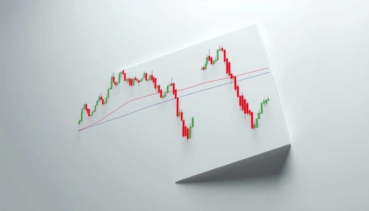
Utilizing Moving Averages and Fibonacci Retracements
Moving averages create dynamic reference lines that adjust with price action. Bitcoin’s 200-day simple moving average near $78,500 serves as a significant benchmark.
Fibonacci retracement tools apply mathematical ratios to price movements. Key percentages like 38.2% and 61.8% often mark important zones.
These indicators work together to strengthen analysis. Multiple converging signals increase confidence in potential reversal areas.
Leveraging Trading Platforms and Automated Tools
Automated technical analysis simplifies the identification process. Platforms like altFINS scan historical data to highlight significant areas.
Volume analysis reveals where substantial trading occurred. These activity clusters often correspond to important price zones.
Candlestick patterns provide visual confirmation at critical junctures. Recognizing formations like hammers or engulfing patterns adds another layer to your chart evaluation.
Combining these tools creates a comprehensive approach to market trend identification. This methodology helps traders make informed decisions about any digital asset.
Identifying Key Support and Resistance Zones in Crypto
Pinpointing crucial price barriers is a fundamental skill for any chart analyst. These areas, formed by past market activity, offer a roadmap for potential future price action.
Effective identification starts with a systematic scan of historical data. Look for points where an asset’s direction clearly changed.
Spotting Trend Reversals and Chart Patterns
Major zones typically form around previous swing lows and highs. A floor develops where buying pressure halted a decline. A ceiling appears where selling overwhelmed buyers.
Consolidation ranges, like Bitcoin trading between $90K and $108K, clearly mark current boundaries. These horizontal channels highlight areas where price is likely to react.

Trendlines offer a dynamic view. Connecting a series of higher lows reveals an ascending floor. Linking lower highs shows a descending ceiling.
Not all barriers are equal. Minor ones may cause brief pauses. Major zones, tested multiple times, often lead to significant movements.
The table below contrasts the characteristics of minor and major price zones:
| Feature | Minor Zone | Major Zone |
|---|---|---|
| Number of Touches | 1-2 price tests | 3 or more price tests |
| Timeframe Significance | Often visible on shorter charts | Appears on higher timeframes (daily/weekly) |
| Expected Price Reaction | Temporary pause or small reversal | Strong reversal or powerful breakout |
| Trader Psychology | Weak collective memory | Strong, reinforced market memory |
Always analyze multiple timeframes. Zones on weekly charts carry more weight than those on hourly ones. This multi-perspective approach helps identify the most significant areas.
Drawing and Refining Support/Resistance Lines Effectively
Effective chart analysis begins with correctly identifying where buyers and sellers have historically clashed. Mastering this skill transforms a simple chart into a powerful decision-making tool.
Techniques for Accurate Line Placement
Start by drawing a horizontal line through significant price peaks and troughs. Many traders use the closing price, as it reflects the final market consensus for a period.
Extend these lines backward on your charts. This validates if past activity also respected the same price level. A zone gains strength when multiple touches occur.
Follow three simple rules for clarity. Ensure your line is perfectly horizontal. Place it only at truly significant areas. Space your lines evenly to avoid a cluttered view. This will help identify potential breakouts clearly.
Common Pitfalls and How to Avoid Them
A major error is marking too many levels. This creates confusion. Focus on the most significant areas where price clearly reversed.
Do not rely solely on recent price spikes. Confirm a zone’s importance with historical data and trading volume. Also, pay attention to both candle bodies and wicks.
Long wicks often signal strong rejection. Finally, think in terms of price zones, not single lines. Markets are volatile, and prices often reverse within a range, not at a precise point.
Advanced Strategies: Combining Multiple Indicators
Elevating your market approach involves integrating various technical signals to confirm potential turning points. This method moves beyond basic chart reading into a more robust analytical framework.
When different tools point to the same price area, it creates a powerful signal cluster. This convergence significantly boosts the probability of a meaningful price reaction.
Confluence Clusters and Price Zones Integration
Confluence occurs when separate methodologies highlight an identical zone. Look for areas where a historical floor aligns with a key Fibonacci retracement and a volume spike.
This multi-layered analysis identifies spots where diverse traders see value. It transforms a simple horizontal line into a high-probability trading zone.

An advanced entry strategy waits for price to touch this cluster. Additional confirmation, like a bullish candlestick pattern, makes the signal even stronger.
Implementing Dynamic Stop-Loss and Take-Profit Tactics
Confluence zones provide logical points for risk management. For a long position, place a stop-loss order just below the confirmed confluence area.
Take-profit targets can be set near the next significant zone above. This strategy manages risk while capitalizing on the prevailing trend.
The table below outlines a systematic approach for trading breakouts using these concepts:
| Action | Signal | Strategy |
|---|---|---|
| Entry | Price breaks above resistance with high volume. | Wait for a retest of the broken zone, now acting as new support. |
| Stop-Loss | Protective order. | Place just below the new support level to limit potential loss. |
| Take-Profit | Price approaches next higher zone. | Set target just below this area where selling pressure may emerge. |
Markets evolve, so regularly update your key zones after major moves. This dynamic approach keeps your analysis relevant.
Real-World Examples and Case Studies in Crypto Trading
Examining actual market data provides the clearest illustration of how technical principles function in practice. These case studies demonstrate the application of core concepts across different digital assets.
Bitcoin, Ethereum, and Altcoin Analysis
Bitcoin’s recent price action offers a textbook example. The asset faced significant selling pressure near the $108,000 mark. This created a clear ceiling that halted upward momentum.
The $100,000 level also served as a psychological barrier. Meanwhile, a firm floor developed around $90,000 where buyers consistently emerged. This established a trading range between these two key price levels.
Solana experienced repeated rejections at $205. Each test reinforced this area as a supply zone. Similarly, Hyperliquid found a ceiling at the round number of $50.
Internet Computer Protocol shows a complete framework. It faced multiple rejections at $6.00, indicating a strong supply area. The $4.50-$5.00 zone acted as a consistent demand area.
Once price breaks above the $6.00 barrier, that level often flips to become a new floor. This demonstrates the polarity principle in action. The next significant ceiling would likely form near $7.00.
Conclusion
Mastering the art of market timing hinges on recognizing pivotal price zones where supply and demand converge. These critical areas represent the foundation of technical analysis for digital asset markets.
The concepts discussed throughout this guide provide traders with essential tools for navigating volatile conditions. Understanding where buying and selling pressure typically emerges helps investors make informed decisions.
Regular monitoring of key zones allows market participants to anticipate potential turning points. This disciplined approach transforms emotional reactions into strategic entries and exits.
Successful trading strategies often build upon these fundamental principles. Continuous practice with real market data strengthens this crucial skill set for all market participants.
FAQ
What are the fundamental concepts behind these price zones?
These zones represent areas on a chart where buying interest (support) or selling pressure (resistance) has historically been strong. They are foundational to technical analysis, helping traders anticipate potential price movements.
How do I accurately draw these lines on a cryptocurrency chart?
Accurate placement involves connecting significant swing highs for resistance and swing lows for support. Using tools on platforms like TradingView, traders can refine these lines by ensuring they touch multiple price points, increasing their reliability.
Can these levels be used for risk management?
Absolutely. These zones are crucial for managing risk. Traders often place stop-loss orders just below a support level or above a resistance level to protect their capital if the price breaks through unexpectedly.
What is the difference between a static and a dynamic level?
Static levels are horizontal lines drawn at specific price points. Dynamic levels, like moving averages or trendlines, change over time and can act as sloping support or resistance, adapting to the asset’s momentum.
How do other indicators, like Fibonacci retracements, work with these zones?
Combining tools creates confluence. For example, a key Fibonacci retracement level aligning with a historical support zone strengthens the case for a potential price bounce, offering a higher-probability entry point.
Why do these price areas sometimes switch roles?
A broken support level often becomes a new resistance level, and vice versa. This role reversal occurs because the market psychology shifts; those who bought at support and are now at a loss may look to sell at breakeven, creating selling pressure.
No comments yet