
Navigating the fast-paced world of digital asset markets requires powerful tools. Many traders turn to mathematical patterns to find order in the chaos. One popular method involves using specific ratios derived from a famous numerical sequence.
This technique helps identify potential areas where a price might pause or reverse. These zones act like magnets, attracting price action after a significant move. Understanding this concept is a cornerstone of modern technical analysis.
Our guide will show you how to apply this method to your own crypto trading strategy. You will learn to spot high-probability entry and exit points. This knowledge is vital for managing risk in volatile conditions.
Key Takeaways
- This method is a widely used technical tool for forecasting price movements.
- It helps pinpoint potential support and resistance zones on a chart.
- Traders use key ratios like 61.8% and 38.2% to make decisions.
- It is particularly useful for identifying strategic entry and exit points.
- Mastering this approach can improve risk management in volatile markets.
- It works best when combined with other indicators for confirmation.
Introduction to Fibonacci in Crypto Trading
Seasoned market participants rely on specific geometric relationships to anticipate price movements. These mathematical tools help identify where prices might pause or reverse direction.
Understanding the Role of Fibonacci Patterns
These mathematical relationships fall into three main categories. Each serves a unique purpose in technical analysis.
Traders use these formations to spot potential turning points. The approach works across different timeframes and asset classes.
| Pattern Type | Key Examples | Primary Use |
|---|---|---|
| Three-Point Patterns | Retracements, Extensions | Identifying pullback levels |
| Four-Point Patterns | ABCD formations | Predicting price targets |
| Five-Point Patterns | Gartley, Butterfly | Complex reversal signals |
The Importance of Support and Resistance in Crypto
Digital asset markets experience extreme volatility. Clear reference points become essential for navigation.
These zones act like price magnets. They attract buying or selling pressure at predictable levels.
Many participants struggle to identify these areas accurately. Mathematical tools provide objective measurements instead of guesswork.
The Basics of Fibonacci Retracement Levels
Leonardo Pisano Bogolla’s numerical discovery continues to influence modern trading approaches. This Italian mathematician uncovered a remarkable pattern in the 13th century.
What is the Fibonacci Sequence?
The Fibonacci sequence begins with 0 and 1. Each subsequent number equals the sum of the two preceding numbers.
This creates the progression: 0, 1, 1, 2, 3, 5, 8, 13, 21, 34, and so on infinitely. The pattern appears throughout nature and mathematics.
Key Fibonacci Ratios and Their Significance
Dividing a number by its immediate successor yields approximately 0.618. This forms the famous golden ratio.
When you divide a number by the value two positions ahead, you get near 0.382. These relationships create the essential Fibonacci ratios.
Traders use percentages like 23.6%, 38.2%, 61.8%, and 78.6%. These values help identify potential market turning points.
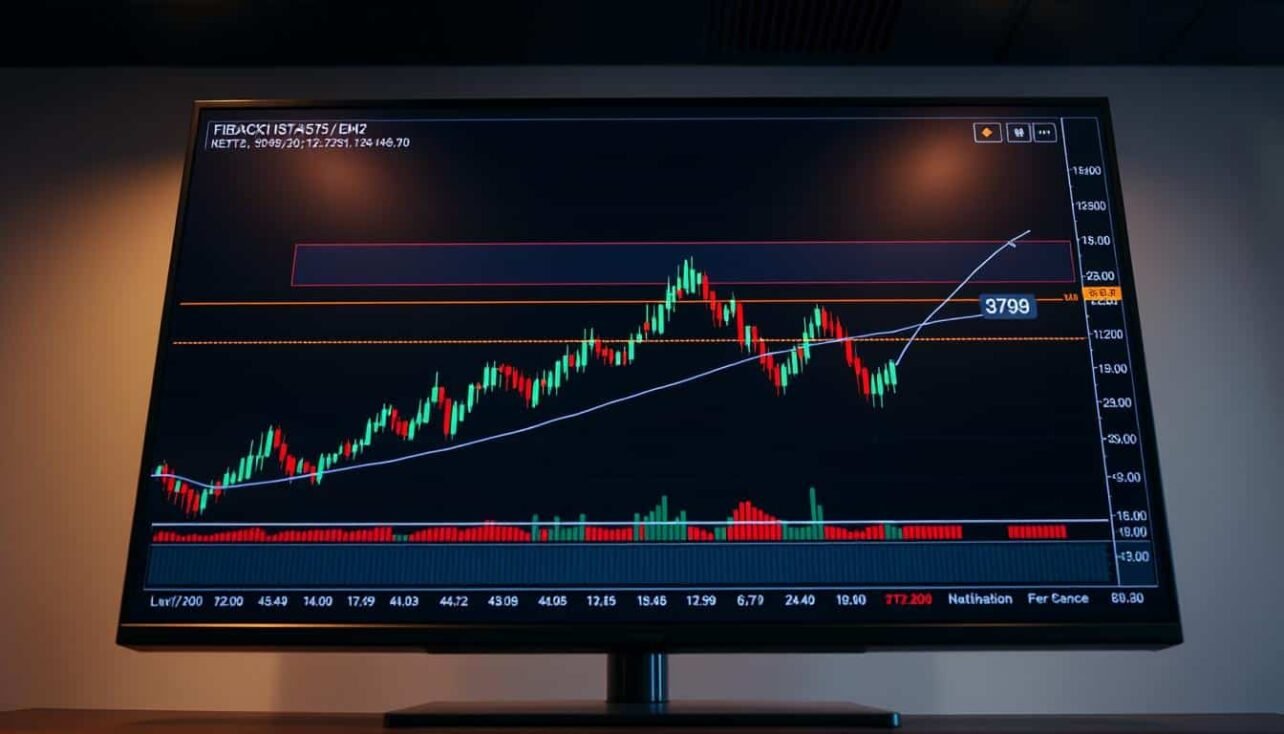
fibonacci retracement levels crypto analysis
The convergence of trader attention at specific percentage zones creates powerful market dynamics for decision-making. These mathematical ratios provide objective benchmarks that remain fixed on charts.
Unlike moving averages that constantly shift, these percentage markers stay in place. This allows for clear anticipation of where prices might react.
How These Levels Guide Entry and Exit Decisions
Market participants watch these zones because trading activity concentrates there. More attention means greater liquidity forms at these points.

The most watched percentage is 61.8%, derived from the golden ratio’s inverse. This zone often sees significant buying or selling pressure.
| Key Ratio | Strength Level | Common Market Reaction |
|---|---|---|
| 23.6% | Weak | Minor pause or bounce |
| 38.2% | Moderate | Noticeable price reaction |
| 61.8% | Strong | Major reversal potential |
| 78.6% | Very Strong | Deep correction zone |
During uptrends, these percentages act as potential support areas for entering positions. In downtrends, they serve as resistance zones for exiting.
Traders use these objective points to time their moves with greater confidence. The framework helps identify where price momentum may shift direction.
Identifying Swing Highs and Lows in Crypto Charts
The first critical step in applying this mathematical tool is pinpointing the most significant turning points on your chart. These peaks and troughs form the foundation for all subsequent calculations.
Accurate identification is essential for generating reliable projections. Choosing the wrong reference points will lead to misleading results.

Techniques for Spotting Critical Price Extremes
A swing high is the highest price point reached before a decline begins. It marks a clear peak where buying pressure subsides.
Conversely, a swing low is the lowest point hit before a rally starts. This trough indicates where selling exhaustion occurs.
To spot these extremes, look for candlestick patterns that show a clear reversal. A series of higher highs confirms an uptrend, while lower lows signal a downtrend.
Volume can provide confirmation. A true swing point often forms alongside a spike in trading activity.
It is crucial to wait for the new trend to be established. Avoid drawing your tool too early before the swing point is confirmed.
The choice of timeframe matters greatly. A swing high on a daily chart is far more significant than one on a 15-minute chart. Always select points that match your trading strategy’s horizon.
Applying Fibonacci Retracements in Cryptocurrency Trends
Putting mathematical ratios into practice on your trading screen transforms theory into actionable strategy. The process begins after you’ve identified significant market turning points.

Step-by-Step Guide to Drawing Retracement Lines
Locate the drawing tools in your charting software. Select the geometric tool that plots horizontal percentage lines.
For an upward movement, click at the lowest point and drag to the highest peak. The software automatically displays key percentage zones across your graph.
These horizontal markers appear at 23.6%, 38.2%, 50%, 61.8%, and 78.6% of the price range. They represent potential areas where the market might pause or reverse direction.
Consider Bitcoin moving from $40,000 to $50,000 before correcting. The 61.8% marker would sit at $46,180. This becomes a critical watch zone for potential buying opportunities.
Most trading platforms like TradingView include this functionality. You can customize which percentage lines remain visible for cleaner chart analysis.
Focusing on the most significant ratios helps streamline your decision-making process. This practical approach turns mathematical concepts into trading advantages.
Advanced Fibonacci Patterns in Crypto Trading
Beyond the foundational retracement tool lies a world of sophisticated geometric formations. These advanced patterns can signal major market shifts with greater precision.
They build upon simple concepts to create complex, high-probability trade setups. Understanding this hierarchy is key for serious market participants.

Three-Point, Four-Point, and Five-Point Patterns
A simple three-point retracement often marks the start of a larger four-point ABCD formation. Many ABCD patterns then evolve into even more complex five-point structures.
This occurs because formations with more points contain those with fewer. It is a nested system of geometric relationships.
Software often displays these emerging formations with grayed-out direction arrows. A pink dot indicates the expected completion level.
This serves as an early warning. For the setup to finalize, price must reach the dot and find support or resistance there.
| Pattern Type | Key Structure | Primary Use |
|---|---|---|
| ABCD | Four-point symmetrical move | Predicting reversal zones |
| Gartley | X-A, A-B (61.8%), B-C, C-D (78.6%) | High-probability reversal |
| Butterfly | Extends beyond X to 127.2% or 161.8% | Deep trend exhaustion |
| Three Drives | Three symmetrical moves and pullbacks | Trend continuation signal |
Emerging Patterns and Their Trading Implications
These advanced formations offer more dependable signals. The Gartley and Butterfly patterns align closely with core mathematical theory.
They meet stricter criteria, which increases their success rate. Traders often favor these for strategic entry and exit points.
Recognizing an emerging pattern allows for preparation. It provides a clear level to watch for a potential trade opportunity.
Integrating Fibonacci with Other Technical Indicators
A single indicator rarely provides complete market insight, making integration of multiple tools essential. This layered approach significantly improves signal reliability and reduces false alarms.
Using RSI, MACD, and Moving Averages Together
Combining momentum oscillators with geometric tools creates powerful confirmation systems. The Relative Strength Index (RSI) can identify divergence at key zones, signaling potential reversals.
Moving averages provide trend context when they cross near significant price areas. This combination helps validate whether a zone will act as support or resistance.
The MACD oscillator adds momentum confirmation to the mix. When multiple indicators align at the same price level, confidence in the signal increases substantially.
| Indicator Type | Primary Function | Integration Benefit |
|---|---|---|
| Moving Averages | Trend identification | Confirms trend direction at key levels |
| RSI | Momentum measurement | Detects divergence for reversal signals |
| MACD | Momentum shifts | Validates momentum changes at critical zones |
| Candlestick Patterns | Price action signals | Provides visual confirmation of level strength |
Candlestick formations like hammers or engulfing patterns near significant areas offer additional visual confirmation. This multi-indicator approach creates a robust framework for decision-making.
Successful traders typically use at least two complementary tools to validate signals. This systematic method reduces reliance on any single indicator’s limitations.
Practical Examples of Fibonacci Trading in Crypto
Examining actual market movements provides the clearest evidence of technical tool effectiveness. Real case studies show how mathematical relationships guide price behavior.
Case Study: Bitcoin Price Movements
Bitcoin’s journey from $40,000 to $50,000 created a perfect scenario for analysis. The subsequent correction demonstrated how mathematical zones influence market behavior.
Price found temporary stability at the 50% mark around $45,000. A Doji candle formation signaled seller exhaustion at this critical juncture.
| Price Level | Mathematical Ratio | Market Reaction |
|---|---|---|
| $42,360 | 23.6% | Minor bounce |
| $43,820 | 38.2% | Noticeable pause |
| $45,000 | 50.0% | Strong support |
| $46,180 | 61.8% | Potential reversal |
Case Study: Ethereum Retracement Levels
Ethereum’s move from $2,400 to $3,000 established clear mathematical reference points. The 61.8% level at $2,808 became a key watch zone.
Traders could enter long positions here with confirmation signals. Proper risk management included stop-loss orders below the 78.6% level.
This approach demonstrates systematic decision-making based on mathematical probabilities. The framework helps identify high-probability entry and exit points.
Best Practices for Using Fibonacci in Trading Strategies
Developing a systematic approach to position management separates amateur speculation from professional trading. A well-defined framework integrates mathematical tools with disciplined risk protocols.
Successful traders build comprehensive strategies that adapt to changing market conditions. This dynamic approach ensures relevance across different timeframes and asset classes.
Risk Management and Setting Stop-Loss Orders
Protecting capital begins with strategic stop-loss placement. Position these orders just below the next mathematical zone to limit potential losses.
Set profit targets at subsequent zones to secure gains. This creates clear risk-reward parameters for each trade.
Market structures evolve constantly. Update your reference points as new swing extremes form to maintain accuracy.
Focus on higher-order patterns like Gartley and Butterfly formations. These complex structures offer more reliable signals for entry decisions.
Many emerging patterns never complete due to strict requirements. Wait for proper confirmation before committing capital to any setup.
Integrate these mathematical tools with position sizing and multiple confirmation methods. This comprehensive approach builds robust trading strategies.
Conclusion
Mastering the application of mathematical ratios provides a significant edge in market strategy. This guide has shown how these concepts create a framework for identifying potential zones where price action may pause or reverse.
You can use this framework to determine strategic entry and exit points. It blends mathematical precision with practical trading strategies.
Remember, no single tool guarantees success. Always confirm signals by pairing these zones with other indicators. For deeper insights into advanced trading strategies, continue your research.
Practice is key to refining your skill in spotting these patterns. Integrate this knowledge with sound risk management for a more disciplined approach to the markets.
FAQ
What is the main purpose of using Fibonacci retracements in cryptocurrency trading?
The primary purpose is to identify potential support and resistance zones. These zones help traders anticipate where a price pullback might end and the main trend could resume, guiding entry and exit decisions.
How accurate are these retracement zones in predicting price reversals?
No tool offers 100% accuracy. These levels work best as a framework for probability, not certainty. They are most effective when combined with other technical analysis tools like moving averages or the RSI for confirmation.
Which Fibonacci ratio is considered the most significant for crypto markets?
The 61.8% level, often called the “golden ratio,” is widely watched. However, the 38.2% and 50% marks are also crucial potential support and resistance areas that traders closely monitor for price action signals.
Can I use this technical analysis tool on any time frame chart?
Yes, you can apply the technique across various time frames, from short-term one-hour charts to long-term weekly views. Higher time frames generally provide more significant and reliable signals for your overall strategy.
What is the biggest mistake traders make when applying this method?
A common error is incorrectly identifying the swing high and swing low points on the chart. The analysis is only as good as the anchor points you select. Always ensure you are drawing the tool from a significant peak to a significant trough.
No comments yet