
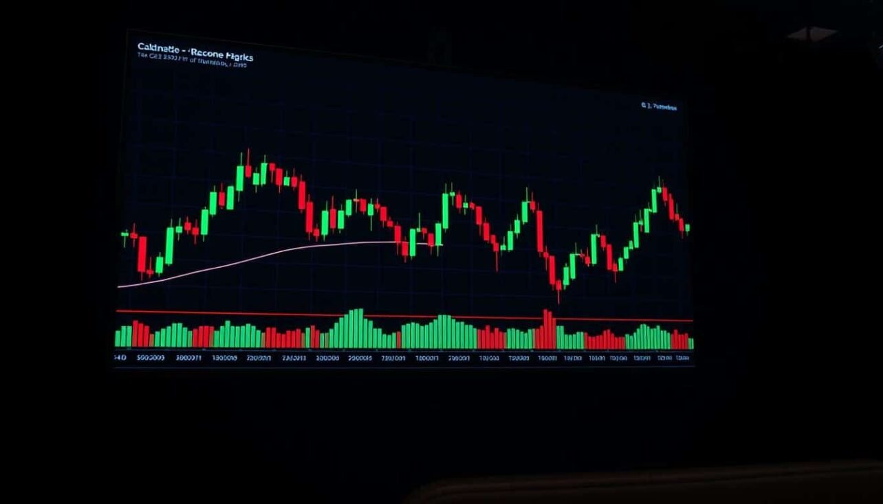
Welcome to your essential guide for understanding market movements. This resource is built for traders who want to gain an edge in their trading activities. We focus on a powerful visual method for analyzing price action.
These visual formations on a chart tell a story. Each candle shows the battle between buyers and sellers during a specific period. By learning to read these shapes, you can spot potential opportunities.
This article provides a clear path from the basics to practical application. You will learn about different formations and what they signal. Our goal is to help you make more informed decisions with confidence.
Key Takeaways
- This guide serves as a visual roadmap for analyzing price charts.
- Individual candles represent price action and market sentiment within a set timeframe.
- Recognizing formations is crucial for identifying potential trend reversals and continuations.
- The information is tailored for the dynamic nature of digital asset markets.
- You will learn how to integrate this analysis with other technical tools.
- Practical applications and risk management are core components of this resource.
Introduction to Crypto Candlestick Patterns
Visual chart formations offer traders immediate insights into market dynamics. These graphical tools represent the ongoing battle between buyers and sellers. Each formation tells a story about price action during specific time periods.
What Are Candlestick Patterns?
These visual formations display four critical data points for each timeframe. They show the opening price, closing price, highest point, and lowest point reached. This condensed information reveals market sentiment clearly.
According to Greg Morris in “Candlestick Charting Explained,” these tools provide more information in a single glance than most other methods. They have become the standard visualization across trading platforms worldwide.
Understanding Their Role in Trading
These formations help identify potential trend reversals and continuations. They reveal shifts in market sentiment without relying on lagging indicators. This makes them particularly valuable for fast-moving markets.
Mastering these visual tools enables quick assessment across multiple timeframes. They serve as a foundation for comprehensive trading strategies when combined with other technical analysis methods.
| Component | Meaning | Trading Significance |
|---|---|---|
| Open Price | Starting price for the period | Shows initial market sentiment |
| High Price | Maximum price reached | Indicates upward pressure strength |
| Low Price | Minimum price reached | Reveals downward pressure level |
| Close Price | Final price for the period | Reflects final market consensus |
The Historical Evolution of Candlestick Patterns
The journey of technical chart analysis spans centuries, beginning in feudal Japan. This visualization method emerged from practical market needs rather than academic theory. Its development reveals how human psychology drives price movements across different eras.
In the 1700s, Munehisa Homma revolutionized rice trading in Sakata. Known as the “God of Markets,” he documented his methods in the Sakata Rules. Homma’s insight focused on market psychology—the emotional battle between buyers and sellers.
From Munehisa Homma to Modern Markets
Japanese chartists refined Homma’s techniques throughout the 1800s. They spread these methods across major trading centers in Osaka and Tokyo. Rice exchanges adopted these visual charts as their primary analysis tool.
The Western world remained unaware of these powerful candlestick patterns until 1991. Steve Nison’s book “Japanese Candlestick Charting Techniques” introduced them globally. This publication transformed an obscure Japanese method into a standard visualization.
Within a decade, these charts replaced traditional bar charts on platforms worldwide. The 2000s saw adoption across stocks, forex, commodities, and digital assets. This universal application proves that market psychology remains consistent across time and asset classes.
The evolution from 18th-century rice trading to modern platforms demonstrates the timeless nature of this analysis. It continues to reveal market sentiment with remarkable accuracy centuries after its invention.
Candlestick Anatomy: Open, High, Low, and Close Explained
The fundamental building blocks of technical chart analysis consist of four critical price points. Each visual element tells a complete story about market movement during a specific timeframe. Understanding these components is essential for accurate interpretation.
Every individual candle displays the opening, high, low, and closing prices. The rectangular body shows the range between the opening and closing values. Thin wicks above and below represent the session’s price extremes.
A green or white body indicates the closing price exceeded the opening level. This shows buyers controlled the session. A red or black body reveals the opening price was higher than the final value.
The body size reflects the strength of price movement during the period. Larger bodies suggest stronger directional conviction. Smaller bodies indicate more balanced trading activity between participants.
Wicks reveal how far buyers or sellers pushed the price before facing rejection. Long upper wicks show failed upward attempts. Extended lower wicks indicate selling pressure that was eventually overcome.
| Component | Visual Representation | Market Significance |
|---|---|---|
| Opening Price | Body edge (top or bottom) | Initial market sentiment |
| Closing Price | Opposite body edge | Final trading consensus |
| High Price | Top of upper wick | Maximum buying pressure |
| Low Price | Bottom of lower wick | Maximum selling pressure |
Mastering these visual elements forms the foundation for recognizing meaningful formations. The relationship between these four points reveals underlying market dynamics. This knowledge enables traders to make more informed decisions.
Core Trading Principles Behind Candlestick Analysis
Three essential principles separate amateur pattern spotting from professional analysis. These rules transform simple visual recognition into a robust trading methodology. They provide the framework for interpreting formations accurately.

The Rule of Context
No formation exists in isolation from market conditions. Always consider the broader trend, support levels, and economic factors. Context determines whether a formation signals reversal or continuation.
A bullish setup at strong support after a downtrend carries significant weight. The same formation in a ranging market may offer little value. Proper context analysis prevents misinterpretation of visual signals.
The Rule of Confirmation and Confluence
Never act on a single formation alone. Wait for additional confirmation through volume spikes or momentum indicators. This filtering process reduces false signals common in volatile markets.
The strongest setups occur when multiple factors align simultaneously. Combine formations with technical tools like moving averages or Fibonacci levels. This layered approach significantly improves trade probability.
These principles create a sophisticated analysis method that accounts for market structure. They validate signals through multiple perspectives for more reliable outcomes.
Recognizing Bullish Candlestick Formations
Bullish formations represent key turning points where market sentiment shifts from selling to buying pressure. These visual setups often appear after extended declines, signaling potential upward movements.
Hammer, Bullish Engulfing, and Morning Star
The Hammer shows a small body with a long lower shadow. This indicates sellers pushed prices down, but buyers aggressively recovered most losses.
Bullish Engulfing occurs when a large green candle completely surrounds the previous red one. This demonstrates strong buying momentum overwhelming prior selling pressure.
The Morning Star is a three-candle reversal pattern showing transition from bearish to bullish sentiment. It begins with a long red candle, followed by a small indecision candle, and completes with a strong green candle.
Piercing Pattern and Inverted Hammer
The Piercing Pattern features a red candle followed by a green candle that closes above the midpoint of the first. This shows buyers recovering significant ground.
An Inverted Hammer appears at downtrend bottoms with a small body and long upper shadow. It suggests buyers tested higher prices, indicating potential reversal strength.
| Formation | Structure | Signal Strength | Key Feature |
|---|---|---|---|
| Hammer | Small body, long lower shadow | Medium | Buyer recovery after sell-off |
| Bullish Engulfing | Large green candle surrounds red | Strong | Complete sentiment shift |
| Morning Star | Three-candle transition | Very Strong | Gradual bullish confirmation |
| Piercing Pattern | Green closes above red’s midpoint | Medium | Partial recovery signaling |
| Inverted Hammer | Small body, long upper shadow | Weak (needs confirmation) | Buyer testing higher prices |
Identifying Bearish Candlestick Setups
Spotting potential trend reversals requires understanding key bearish formations. These visual signals appear when buying momentum weakens and selling pressure begins to dominate.
Several distinct formations serve as reliable warning signs. Each has unique characteristics that signal shifting market sentiment.
Shooting Star and Bearish Engulfing
The Shooting Star shows a small body with a long upper shadow. It forms after an uptrend when sellers reject higher prices.
Bearish Engulfing occurs when a large red candle completely surrounds the previous green one. This pattern indicates strong selling pressure overwhelming buyers.
Evening Star and Dark Cloud Cover
The Evening Star is a three-candle reversal pattern showing transition from bullish to bearish control. It often marks significant reversal points at market tops.
Dark Cloud Cover features a bearish candle that opens above the previous high but closes below the midpoint. This demonstrates failed bullish attempts and emerging bearish reversal strength.
| Formation | Appearance | Signal Strength | Key Indicator |
|---|---|---|---|
| Shooting Star | Small body, long upper shadow | Medium | Price rejection at highs |
| Bearish Engulfing | Large red surrounds green | Strong | Complete sentiment shift |
| Evening Star | Three-candle transition | Very Strong | Gradual bearish confirmation |
| Dark Cloud Cover | Opens high, closes low | Medium | Failed breakout attempt |
| Hanging Man | Small body, long lower shadow | Weak (needs confirmation) | Emerging selling pressure |
These bearish candle setups provide early warnings of potential reversals. Proper recognition helps traders anticipate downward movements.
Continuation Patterns for Trade Persistence
Market consolidation often reveals itself through specific visual formations that signal temporary pauses in momentum. These patterns indicate the prevailing trend will likely resume after a brief period of equilibrium.
Understanding these formations helps traders distinguish between genuine reversals and temporary consolidation phases. They represent moments when neither buyers nor sellers establish clear control.
Doji and Spinning Top Formations
The doji occurs when opening and closing prices are virtually identical. This creates a cross-like shape showing perfect balance between market forces.
A dragonfly doji features a long lower shadow with no upper wick. When this appears during downtrends, it suggests sellers pushed prices down but buyers recovered all losses.
The spinning top shows a small body with balanced upper and lower shadows. This indicates market indecision where neither side gained significant ground during the session.
Three Methods Pattern Structure
The Rising Three Methods begins with a strong bullish candle. Three smaller bearish candles follow, staying within the first candle’s range.
The pattern completes when another strong bullish candle closes above the initial candle’s close. This confirms buyer momentum has returned.
The bearish counterpart follows the same structure in reverse. Both variations signal trend persistence after consolidation.
| Pattern Type | Formation Characteristics | Market Signal | Confirmation Requirement |
|---|---|---|---|
| Doji | Open/close nearly equal, small body | Market equilibrium | Next candle direction |
| Spinning Top | Small body, balanced shadows | Temporary indecision | Breakout from consolidation |
| Rising Three Methods | Five-candle bullish structure | Trend continuation | Final candle above range |
| Falling Three Methods | Five-candle bearish structure | Downtrend persistence | Final candle below range |
These continuation patterns work best when they form during established trends. The consolidation range should be relatively tight, indicating controlled pause rather than chaotic trading.
Mastering Technical Analysis with Candlestick Patterns
Professional traders elevate their chart analysis by combining visual formations with technical indicators. This integration creates a robust system that validates signals through multiple independent sources. The approach significantly improves trading precision and decision confidence.

Isolated signals often lack the strength needed for reliable trading decisions. By layering different analytical tools, traders can filter out false signals. This method provides clearer market direction and momentum confirmation.
Integrating Trend, Volume, and Indicators
Combining a hammer formation with RSI oversold conditions creates a powerful setup. When RSI drops below 30 near support levels, it indicates exhausted selling pressure. The hammer’s appearance then signals potential reversal strength.
Engulfing formations gain tremendous reliability when accompanied by volume spikes. A 200% increase in trading activity validates the reversal’s conviction. This volume confirmation shows genuine market participation behind the move.
Doji formations become particularly significant when MACD shows divergence. Price making new extremes while MACD fails to confirm indicates weakening trend momentum. This combination often precedes substantial market reversals.
Successful technical analysis requires understanding how these elements interact. Trend context determines whether a signal suggests reversal or continuation. Volume provides the fuel that gives patterns their power.
Effective Risk Management and Trade Strategy
The foundation of sustainable trading success lies not in perfect pattern recognition, but in disciplined risk control. Even the most reliable visual formations can fail, making proper risk management absolutely essential for long-term consistency.
Always set stop-loss orders below support levels for bullish trades or above resistance for bearish positions. This ensures you exit with a predefined loss if the setup fails. Proper placement protects your capital from catastrophic losses.
The golden rule dictates risking no more than 1-2% of total capital per trade. This discipline protects against account-destroying losing streaks regardless of your confidence in any particular pattern.
Risk-to-reward ratios must be favorable before entering any position. Most professionals require at least a 1:2 ratio, meaning you risk $1 to potentially make $2. Better ratios like 1:3 ensure winning trades compensate for inevitable losses.
Key risk management principles include:
- Calculate position size based on stop-loss distance to maintain consistent risk percentage
- Implement maximum daily loss limits to prevent emotional trading
- Manage correlation to avoid overexposure to similar market movements
- Scale into positions gradually rather than committing full capital immediately
Combining sound risk management with your chart analysis creates a robust system that withstands market volatility. This approach maintains long-term consistency even during periods of drawdown.
Advanced Pattern Recognition and Automated Tools
Modern trading platforms now leverage sophisticated algorithms to scan charts automatically. This technology saves traders countless hours of manual work. It identifies potential opportunities across many assets at once.

These systems analyze price action across different time intervals. They look for specific formations that signal potential market moves. The best tools provide real-time alerts for these setups.
Chart Pattern Automation and Software Insights
Automated analysis offers a significant edge in speed and consistency. It removes emotional bias from the initial detection phase. This leads to more objective decision-making.
Software can process vast amounts of historical data. It assesses the statistical performance of each formation. This helps traders understand the probability of success.
However, the final analysis still requires human judgment. Traders must evaluate the broader market context. They also need to manage risk appropriately for each trade.
| Aspect | Manual Analysis | Automated Tool |
|---|---|---|
| Speed | Slow, methodical | Instant, continuous |
| Coverage | Limited number of charts | Thousands of assets simultaneously |
| Objectivity | Prone to emotional bias | Consistently rule-based |
| Context Integration | High, intuitive | Limited, requires manual input |
The most effective strategy combines the power of automation with experienced discretion. Use the tool to find signals, but use your skill to execute them.
Optimizing Your “crypto candlestick patterns cheat sheet”
Color-coded visual aids provide immediate recognition advantages when market conditions change rapidly. Your quick-reference guide should feature clear visual distinctions between different formation types. This organization helps traders make faster decisions during active sessions.
How to Leverage the Cheat Sheet for Quick Trades
Keep your reference material easily accessible during all trading activities. Many professionals maintain both digital and printed versions for instant consultation. This ensures you can quickly verify formations as they develop.
Organize your resource by category—bullish reversals, bearish reversals, and continuation setups. This logical structure helps you find relevant information based on current market context. Each section should include confirmation requirements and success probabilities.
Study a limited number of formations each week until recognition becomes automatic. Daily practice with live charts accelerates your learning curve significantly. Consistent exposure trains your eye to spot opportunities instantly.
Remember that your reference guide supports rather than replaces comprehensive analysis. Always combine formation signals with volume confirmation and trend context. This integrated approach produces more reliable trading outcomes.
Printable Resources and Digital Tools for Traders
Physical and digital resources provide traders with immediate access to critical market signals. Having reference materials readily available transforms how you approach technical analysis during active sessions.

Printable PDF guides offer significant advantages for quick recognition. You can post these references near your workstation for instant consultation. This eliminates screen switching when you need fast confirmation.
High-quality resources feature clear visual examples of each formation. They include concise explanations that help you act with confidence. Better-informed decisions naturally lead to improved risk management.
Digital tools complement printable materials with interactive features. Pattern scanners and real-time alerts notify you when setups form. Mobile applications extend your learning beyond the desktop environment.
Whether you’re beginning your journey or refining advanced skills, comprehensive guides accelerate the learning process. They combine visual charts with detailed explanations for effective education.
The best resources organize formations by category with color-coding. This visual hierarchy helps you locate specific types quickly. Time-sensitive opportunities demand this efficient reference system.
Free downloadable materials serve as excellent starting points. They provide foundational knowledge without financial barriers. This accessibility helps develop essential visual recognition abilities.
Interpreting Automated Pattern Recognition in Crypto Markets
Automated tools now scan charts across four time intervals to spot potential opportunities. These systems identify around 27 common formations. However, the trader’s judgment remains critical for success.
Software provides alerts, but you must assess the market context. You manage entry points and stop-loss levels. The goal is to select setups with the highest probability.
Using Multi-Timeframe Analysis for Precision
Examining a pattern across different timeframes reveals its true significance. A signal on a 15-minute chart might be minor. The same signal on a 4-hour or daily chart often indicates a stronger trend change.
This multi-interval analysis helps filter out noise. It confirms whether a move has substantial follow-through potential. This is a core part of effective technical analysis.
Historical data shows these formations work about 70% of the time. This means roughly 30% of signals will fail. Strong risk management is therefore non-negotiable.
The most reliable signals appear on multiple timeframes simultaneously. This shows agreement among traders with different perspectives. It significantly boosts the confidence in a trade setup.
| Timeframe | Signal Significance | Trader Action |
|---|---|---|
| 15-minute | Short-term fluctuation | Quick scalp trade potential |
| 1-hour | Intra-day move | Day trading opportunity |
| 4-hour | Multi-day swing | Swing trade with wider stop |
| Daily | Major trend change | Position trade with high conviction |
Always verify the quality of an automated alert. Check the candle structure and volume confirmation. Proper positioning within the larger price range is essential.
Evaluating Pattern Reliability: Success Rates and Backtests
Quantitative research demonstrates significant variations in success rates across different price action formations. Not every visual signal offers the same probability of success.
According to Quantified Strategies’ backtests, Bullish Marubozu formations deliver 65-70% success rates in trending conditions. This makes them among the more reliable single-candle setups.
Statistical Insights and Performance Metrics
Bulkowski’s research shows Doji formations achieve only 50-55% success rates. Their effectiveness depends heavily on position within the trend and confirmation signals.
The CFA Institute found Dragonfly Doji patterns demonstrate 55-60% success when confirmed properly. Liberated Stock Trader’s backtest on 1,703 trades showed similar results at 55.3%.
A 2021 study on Chinese equities revealed impressive results. Using two-day formations with machine learning delivered 36.7% average annual returns.
These metrics help traders focus on historically proven formations. Understanding actual success rates leads to better position sizing and risk management.
Tips and Best Practices for Consistent Trading
Building consistent trading habits requires deliberate practice and systematic learning approaches. These methods separate successful traders from those who struggle with inconsistency.
Start by studying a few formations each week until recognition becomes automatic. Focus on understanding their psychological drivers and confirmation requirements.
Daily Pattern Recognition and Continued Learning
Daily practice with live charts develops essential visual skills. This routine helps you spot opportunities in real market conditions.
Never rely on single signals alone. Combine them with trend analysis and volume confirmation for higher accuracy.
Monitor market sentiment through news and social media trends. The same formation can produce different outcomes depending on overall sentiment.
Maintain a detailed journal documenting each trade’s setup and outcome. This creates valuable feedback for improving your trading approach.
Understand that buying momentum varies across different assets. Adapt your strategies based on current market conditions.
Continued learning ensures your skills evolve with changing market dynamics. Stay informed about new research and techniques.
Conclusion
Effective technical analysis relies on understanding the visual language that price action communicates across different timeframes. This comprehensive guide has equipped you with essential knowledge for interpreting market movements.
Mastering these visual formations requires consistent practice and application. The payoff is substantial—you gain the ability to read market sentiment with greater precision.
Your quick-reference resource should remain accessible during all trading sessions. It enables rapid identification when opportunities emerge in fast-moving markets.
Remember that successful trading combines pattern recognition with disciplined risk management. Always consider broader market context rather than relying on isolated signals.
Continue developing your skills through daily practice and systematic study. This journey transforms you from pattern recognition beginner to confident practitioner.
FAQ
What is the most important principle when using candlestick patterns for analysis?
The most critical principle is context. A bullish engulfing pattern, for example, holds more weight when it appears after a downtrend rather than in the middle of a trading range. Always analyze the formation within the broader market trend and sentiment for accurate signals.
How reliable is a dragonfly doji as a reversal signal?
A dragonfly doji indicates a potential bullish reversal, showing that sellers pushed the price down but buyers managed to push it back to the opening level. Its reliability increases significantly when it appears at a clear support level and is confirmed by strong buying momentum on the next candle.
Can candlestick patterns be used alone for trading decisions?
While powerful, these patterns should not be used in isolation. For better risk management, they work best when combined with other tools like volume analysis, trend lines, and technical indicators such as the RSI or MACD to confirm the strength of the signal.
What is the difference between a hammer and an inverted hammer?
Both are potential reversal patterns with long lower shadows. A hammer appears at the bottom of a downtrend, while an inverted hammer has a long upper shadow and also suggests a bullish reversal. The key difference is the shadow placement, indicating different buying pressure dynamics.
How does the three white soldiers pattern indicate market strength?
The three white soldiers pattern consists of three consecutive long bullish candles that open within the previous candle’s body and close near their highs. This formation signals strong, sustained buying pressure and a robust shift in momentum from bears to bulls, often confirming a new uptrend.
What does a spinning top candle tell you about market sentiment?
A spinning top has a small real body with shadows on both ends, indicating indecision. It shows that neither buyers nor sellers could gain control during the session. This pattern often suggests a potential pause or reversal in the current trend, especially after a strong price move.
Are bearish reversal patterns like the evening star effective in crypto markets?
Yes, patterns like the evening star can be very effective. This three-candle pattern signals a top and a potential bearish reversal. However, due to the high volatility in digital asset markets, always look for confirmation from subsequent price action and volume to validate the signal before entering a trade.
No comments yet