
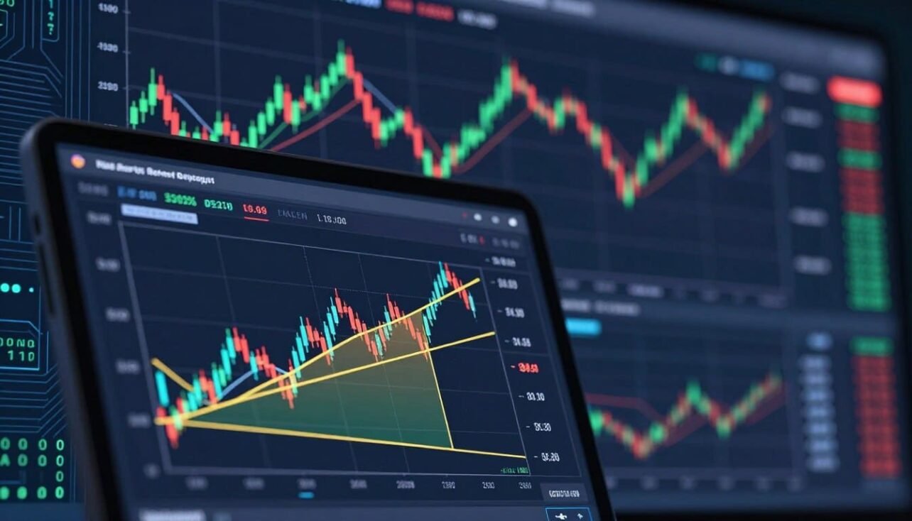
This short guide explains how a classic ratio tool maps potential support and resistance after a strong move. You will learn what the tool shows on a price chart and how traders use those horizontal levels to plan entries and exits.
The tool overlays key percent points—23.6%, 38.2%, 50%, 61.8%, 78.6%—to highlight likely zones for pullbacks. These levels often show up where buyers or sellers pause, helping time pullbacks and rebounds in a fast, sentiment-driven market.
Traders pair these marks with volume, trend lines, or candlestick signals to avoid emotional choices and add structure to risk management. Remember, the method is a decision framework, not a guarantee. It works best with confirmation and clear rules for stops and targets.
For a practical how‑to and chart examples, see this detailed guide on using the tool: how to use fibonacci retracement in crypto.
Why Fibonacci Retracement Matters in Today’s Crypto Market
Volatile swings and fast mood shifts make clear support and resistance mapping essential for modern crypto traders. Rapid moves create frequent pullbacks and sharp reversals that can ruin unplanned positions.
Traders rely on structured levels to spot where buyers or sellers will likely enter. These zones help define risk and set clear stop-loss points.
Liquidity clustering around popular ratios causes price to pause, bounce, or wick. When many participants watch the same marks, orders pile up and reactions grow stronger.

This behavior often turns those marks into self-fulfilling decision points: concentrated orders can cause bounces, rejections, or quick spikes. That makes the tool useful for both bullish pullbacks and bearish rejections.
- Why it helps: Easier to draw consistent zones than guessing from raw price action.
- Practical outcome: More reliable entries, clearer exits, and better position sizing.
- Reality check: These are areas of consensus, not magic lines — traders still need confirmation.
How trader sentiment and liquidity shape decisions
Next, we’ll explain where those levels come from and why markets use them across timeframes and assets.
What Fibonacci Retracement Is and Where the Levels Come From
The sequence behind these chart marks begins with a simple rule that builds every next number from its two predecessors. A short example shows how it works: 0, 1, 1, 2, 3, 5, 8, 13. Each new number equals the sum of the two preceding numbers.

The math that creates useful ratios
Dividing values from the sequence produces stable ratios traders use on charts. For example, 8 ÷ 13 ≈ 0.615 and 8 ÷ 21 ≈ 0.381. These quotients round to common percentages and form the basis for practical ratios.
How ratios map to chart levels
Those ratios translate into retracement levels, shown as percentages of a prior impulse move. Platforms plot levels automatically by measuring the distance between a swing high and a swing low and then applying the percentages across that range.
Key levels traders watch
- 23.6% — shallow pullbacks often stall here.
- 38.2% — a common early support or resistance zone.
- 50% — not a true ratio but a useful midpoint.
- 61.8% — the golden zone many watch closely.
- 78.6% — deep retracements that can still resume trend.
The math gives reference points; the application needs correct anchoring and confirmation. For a practical primer on the classic tool and how these values are derived, see this detailed guide: fibonacci retracement levels explained.
Fibonacci Retracement in Crypto Analysis
This method maps likely zones where price tends to pause after a sharp directional move.
What the tool is designed to identify
The overlay plots possible support and resistance areas during pullbacks and rebounds. Traders watch these levels as reference zones where orders often cluster.

When it works best
It is most useful after a clear impulse move — a strong, fast leg up or down. A correction follows that leg and traces part of the original move back toward the prior price.
An impulse move means large candles, high volume, and a visible trend direction. A correction shows smaller, choppy candles and lower momentum as price tests the move.
- Practical use: Traders place entries near retracement levels to catch a reversal back into the trend.
- Common behavior: Price often pulls back, bounces, or rejects near these lines before choosing a direction.
- Risk control: Treat levels as zones and wait for confirmation — do not trade them blindly.
Execution depends on correct anchoring on your charting platform and pairing the tool with volume or pattern confirmation.
How to Draw Fibonacci Retracement Levels on a Crypto Chart
Start by spotting the last clear swing high and swing low that define the recent move on your chart. A swing low is the lowest point before price turns up. A swing high is the highest point before a drop.
Step-by-step:
- Confirm a completed trend by zooming out so the move looks meaningful, not noise.
- Select the fibonacci retracement tool on your platform.
- Click the start point of the move, then the end point — two clicks place the levels.
Uptrend vs. downtrend: Draw from low to high for an uptrend so levels project pullback zones. Reverse that order for a downtrend so levels show rebound resistance. Direction matters because the tool measures from the true impulse.
TradingView and KuCoin: On TradingView find the tool in the left toolbar under “Pitchfork & Fib” or search. On KuCoin open the chart tools menu and choose the retracement tool, then click the two swing points.
Customize visible retracement levels to show 23.6%, 38.2%, 50%, 61.8%, and 78.6%. Hide extra lines for clarity.
Common mistakes: Anchoring to wicks inconsistently, using unconfirmed swings, mixing timeframes, or ignoring impulse endpoints. Each error shifts the levels and mislabels key points.
Validation tip: zoom out and re-draw as new swings form — redrawing is normal in fast markets.
, each line prominently colored for clarity and contrast against the chart. The background should be a subtle grid pattern, emphasizing the analytical aspect of charting. Use soft, diffused lighting to create a professional atmosphere, and angle the chart slightly from the left for a dynamic perspective. The overall mood should convey precision and analysis, ideal for a financial context, without any text or extraneous elements.")
How to Read Retracement Levels as Potential Support and Resistance
Viewing these static percentage bands helps traders decide where a pullback may find support or face resistance. Use them as reference zones, not exact price pins.
Interpreting levels in an uptrend
In an uptrend, treat each level as a possible support area where buyers may step back in. Shallow pulls often stop early; deeper pulls may test stronger zones before continuation.
Interpreting levels in a downtrend
For a downtrend, the same marks flip to resistance. Rebounds that stall near a level often lead to rollovers and fresh selling pressure.
Why the 61.8% level matters
61.8% draws attention because many traders watch it. That concentration of orders makes it a high-probability area for decisive bounces or rejections.
Practical notes on each level
- 23.6% — shallow, strong momentum keeps price here.
- 38.2% — common, useful for early re-entries.
- 50% — psychological midpoint many respect.
- 61.8% — deep but tradable with confirmation.
- 78.6% — very deep; trend may be at risk.
Static vs. dynamic: These levels stay fixed for the swing, unlike moving averages that shift candle by candle. That fixed nature helps plan stops and targets, but always treat marks as zones and require entry, exit, and risk rules before trading.
Building a Trading Strategy Around Fibonacci Retracement
A compact plan helps you act on pullbacks without racing the market. Start with a clear framework so entries and exits are decisions, not guesses.
Planning entries during pullbacks
Identify the impulse move, draw the levels, then mark candidate zones before price arrives. Use limit orders near a level and wait for stabilization.
Practical tip: Avoid chasing. Place an order slightly from the level and only take the entry if price shows a clean, calm reaction.
Structuring exits with realistic targets
Set profit targets at prior swing highs or the next key level. Avoid arbitrary guesses; pick measurable targets and scale out to lock gains.
Defining invalidation and stop-loss placement
Use the retracement levels to place stops just beyond a nearby line. That defines where the setup is invalid and limits loss if the move becomes a reversal.
Waiting for confirmation and adapting the plan
Many traders wait for a second test of a level: price reacts, then retests. Acting on the retest reduces false signals.
- Framework: mark impulse, draw levels, plan entry exit before trading.
- Order type: prefer limit orders and wait for stabilization.
- Context: adjust targets and stops for trend strength and volatility.
Next: filter these setups with trend and momentum indicators to raise probability before you place a trade.
Confirming Fibonacci Signals With Other Indicators and Price Action
A clean setup combines a trend filter, a level test, a candle signal, and matching momentum. Use this sequence to reduce false hits when price meets a retracement zone.
Moving averages as trend filters
Simple moving averages and EMAs act as directional filters. When price sits above the 50 or 200 MA, favor long setups at key levels.
Flip that logic for shorts: downtrends get priority when price is below the moving averages.
RSI, MACD, and Stochastic for momentum
Oscillators confirm whether momentum supports a bounce or continuation. Look for RSI or Stochastic turning up near a level or MACD cross signaling a shift.
Divergence between price and an oscillator near a zone often signals weakening pressure and higher chance of reversal.
Candlestick patterns that strengthen setups
Watch for doji (indecision), hammer (rejection), or bullish/bearish engulfing candles at a level. These patterns add weight to the signal.
- Checklist: trend filter (MA) + level hit + candle signal + momentum agreement.
- Why combine tools: agreement across indicators lowers false positives in volatile markets.
- Reminder: confirmation raises probability, not certainty.
Next: once a trade triggers, use extension tools to plan targets beyond the original swing.
Using Fibonacci Extensions to Set Price Targets Beyond the Swing
Extensions project future target zones beyond the original swing. They help you turn a confirmed move into measurable price points for exits.
How they differ: Retracement lines map how far a pullback went inside the swing. Extensions forecast where the next moves may reach past the swing high or low. Use retracement first to verify the pullback, then switch to extensions to plan targets.
Common extension levels and their use
- 61.8% — a conservative first target for partial profit taking.
- 100% — projects a move equal to the original impulse; useful for full-target plans.
- 161.8% — a primary trend-following level where momentum often extends.
- 200% and 261.8% — aggressive targets for strong movements and big trends.
Practical workflow: draw the retracement to anchor the swing, then enable extension plotting on the same points. Mark several levels and plan to scale out.
Scale exits: take partial profits at early levels and leave a run for higher levels if momentum aligns. Always check that extension targets match prior structure, like past highs or support zones, for higher confidence.
Extensions and patterns serve as building blocks for multi-point setups. Use them alongside fibonacci ratios and price action to form complete trade plans.
Beyond Retracements: Fibonacci Patterns Crypto Traders Watch
Chart patterns built from common ratios give traders advance signals before a decisive swing. These grouped formations extend simple levels into shapes that help identify potential pauses, pivots, or trend continuation.
Three-point setups as early warnings
Three-point patterns use a single retracement or extension to mark a likely reaction zone. They act as an early warning when momentum slows and price nears a key level.
ABCD symmetry and reversals
The four-point ABCD shows symmetry: AB mirrors CD while BC often aligns with a retracement level. That balance helps traders spot likely reversal points and plan entries or stops.
Five-point patterns: higher confidence
Gartley, Butterfly, and Three Drives use strict ratio rules. Because they demand exact alignment across several points, they often carry more weight than simple patterns.
Emerging setups and completion rules
“Emerging” means a pattern is forming but not yet valid. Price must hit the completion zone and then show a clear support or resistance reaction before you treat it as a trade signal.
- Start with clear swings: avoid overfitting by anchoring to real points.
- Check ratios: retracements and extensions are the building blocks.
- Require confirmation: use candles or indicators before entering.
Conclusion
A disciplined routine for spotting swing points and drawing levels improves trade consistency. Use fibonacci retracement as a repeatable method to map likely support and resistance zones after clear price movements.
Draw from the correct swing, respect trend direction, and treat each level as a zone, not a pin. Plan your entry, place stops beyond invalidation points, and set exits at realistic targets or extensions.
Combine the tool with moving averages, RSI, MACD, and candlestick signals to raise probability. No tool guarantees wins, so prioritize risk management and journal setups on a few major coins to learn how price reacts to these points.
FAQ
What is the tool and how does it help crypto traders?
The tool maps percentage retrace levels between a recent swing high and swing low to highlight potential support and resistance zones. Traders use these levels to plan entries, exits, and stop placement during pullbacks after a strong directional move.
How do the number sequence and the “two preceding numbers” rule relate to these ratios?
The sequence produces ratios by dividing one number by the next or by numbers two or three steps ahead. Those ratios — including 61.8% and 38.2% — are then applied to price ranges to generate commonly watched levels on charts.
Which levels should I focus on when scanning crypto charts?
Common levels include 23.6%, 38.2%, 50%, 61.8%, and 78.6%. Traders often monitor 61.8% closely as a key reaction point, while 38.2% and 50% frequently act as shallower pullback targets in strong trends.
When does this method perform best in volatile markets?
It works best after a clear impulse move followed by a corrective pullback. High volatility makes support and resistance zones more important because price often respects these levels short term, allowing disciplined entries with defined risk.
How do I draw levels correctly for an uptrend vs. a downtrend?
In an uptrend, anchor the tool at the recent low and drag to the swing high. For a downtrend, start at the swing high and drag to the recent low. Correct anchoring ensures levels align with the true corrective range.
What are common anchoring mistakes that skew the levels?
Mistakes include using insignificant micro-swing points, failing to account for wick extremes, and anchoring across different timeframes. These errors shift the level placements and produce misleading zones.
How should I interpret levels during an uptrend?
In an uptrend, levels act as pullback zones where buyers may re-enter. Shallow retracements (23.6%–38.2%) imply strength, while deeper tests near 50%–61.8% can offer higher-reward entry opportunities if momentum confirms.
How do levels behave during a downtrend?
In a downtrend, retrace levels become resistance where sellers may reassert control. Price rallies often stall near 38.2%–61.8%, and failure to break above key zones can signal continuation of the decline.
Why is the 61.8% level called the “golden ratio” and why do traders watch it?
The 61.8% ratio stems from the sequence and appears across many natural systems. In markets, it often marks a critical equilibrium where corrective pressure can end and the original trend resumes, making it a focal point for entries and reversals.
How can I build a trading plan around these levels without guessing targets?
Use levels to define entry zones, place stop-losses beyond invalidation points, and set profit targets at higher retracements or extension levels. Combine with position sizing and a clear risk-reward framework to avoid impulsive decisions.
What confirmation should I wait for before entering a trade at a level?
Look for a second test or a clear price reaction—such as a bullish engulfing, hammer, or RSI divergence—near the level. Many traders also use moving averages or MACD crossovers as trend filters to reduce false signals.
Which indicators pair well for confirming signals?
Simple moving averages help identify trend direction. Momentum tools like RSI, MACD, and Stochastic confirm strength or weakness. Candlestick patterns provide short-term entries or rejections that add conviction.
What are extension levels and how do they differ from retrace levels?
Extension levels project price targets beyond the original swing range using similar ratios (61.8%, 100%, 161.8%, 200%, 261.8%). While retrace levels mark correction zones, extensions forecast where the next impulse might find targets or resistance.
How do pattern traders use these ratios for ABCD, Gartley, or Butterfly setups?
Pattern traders map specific retrace and extension ratios to define each leg. ABCD relies on symmetry and matching retrace/extension relationships, while Gartley and Butterfly require precise ratios across five points to increase confidence in a reversal.
Can moving averages be more reliable than these static levels?
Moving averages are dynamic and react to price shifts, acting as trend filters. Retrace levels are static and can provide clearer horizontal zones. Many traders use both: averages for trend context and retrace levels for precise entry zones.
Are these levels self-fulfilling and why do they sometimes fail?
Levels can become self-fulfilling because many participants watch them and place orders there. They fail when anchoring is poor, market momentum overwhelms the zone, or major news shifts sentiment, so always manage risk accordingly.
Which platforms let me customize and save these levels easily?
Platforms like TradingView, Binance, and KuCoin offer built-in retrace tools with customizable ratios and templates. Save presets for your preferred levels and timeframes to maintain consistency across charts.
No comments yet