
Successful digital asset traders rely on powerful tools to navigate volatile conditions. One essential instrument for making informed decisions is the depth chart, which reveals critical supply and demand dynamics.
These visual displays show real-time order book data, representing buy and sell orders at various price levels. They provide a clear picture of current sentiment and potential price movements. Understanding this information helps traders identify optimal entry and exit points.
Both beginners and experienced participants benefit from mastering depth chart analysis. This skill allows for better assessment of liquidity and helps spot potential manipulation. The knowledge gained goes beyond theory, offering practical applications for daily trading activities.
By learning to interpret these visual tools, traders can make data-driven choices that align with actual conditions. This comprehensive approach to understanding market dynamics provides a significant advantage in the competitive digital asset space.
Key Takeaways
- Depth charts visually represent supply and demand dynamics in real-time
- They help identify optimal entry and exit points for trades
- These tools reveal market sentiment and potential price movements
- Understanding depth charts helps assess market liquidity effectively
- They can reveal potential market manipulation patterns
- Depth chart analysis provides practical, actionable trading insights
- Mastering this skill leads to more informed, data-driven decisions
Introduction to Crypto Market Depth Charts
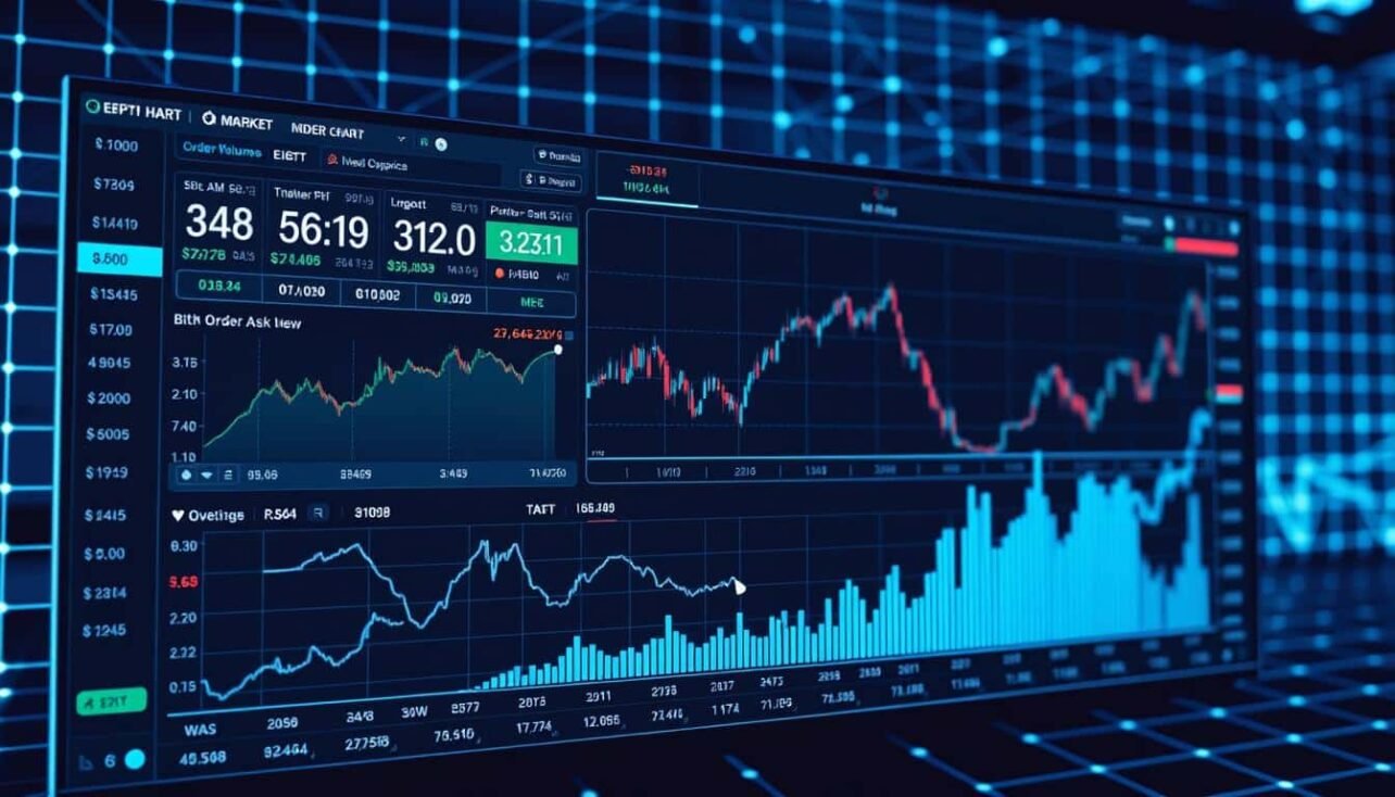
Graphical representations offer traders immediate insights into supply and demand dynamics. These tools transform complex numerical information into accessible visual formats.
What Are Depth Charts?
A depth chart serves as a graphical representation of an order book. It displays all active buy and sell orders for a specific digital asset.
This visualization shows the volume of established limit orders at various price levels. The chart transforms lengthy lists of numerical data into an easily digestible format.
The Role of Order Books in Trading
An order book contains the complete list of limit orders organized by price level. It provides a real-time snapshot of market interest across different price points.
Market makers place bid and ask limit orders in the book. Market takers execute trades by accepting these prices. This interaction creates constant updates to the order book data.
| Participant Type | Primary Function | Impact on Market | Order Type |
|---|---|---|---|
| Market Makers | Place limit orders | Provide liquidity | Bid and Ask |
| Market Takers | Execute existing orders | Remove liquidity | Market orders |
| Both Participants | Facilitate trading | Create price movement | Various order types |
Most major exchanges provide interactive depth charts alongside their order books. Traders can hover over specific points to view detailed order volumes and cumulative values.
Understanding the Components of a Depth Chart
Breaking down a depth chart into its core parts makes interpretation much simpler. Each element provides specific information about current trading conditions.

Bid and Ask Lines
The green bid line slopes downward from left to right. It shows cumulative buy orders at various price levels below the current price.
The red ask line moves upward from right to left. This represents sell orders waiting above the current trading price.
Horizontal and Vertical Axes Explained
The horizontal axis displays the range of available prices. Current trading activity typically centers here.
Vertical axes measure order volume. The left side shows total buy value while the right displays sell quantities.
The gap between closest bid and ask points represents the spread. This difference indicates immediate transaction costs.
Traders can zoom to examine specific price points or view broader market structure. This flexibility helps analyze different trading levels effectively.
Mastering how to read crypto market depth charts
Beyond basic lines, these visual tools display powerful formations that signal strong market conviction. These vertical clusters of orders reveal where participants place their strongest beliefs about future price movement.

Interpreting Buy Walls and Sell Walls
Buy walls appear as steep rises on the green, left side of the display. They represent large clusters of buy orders at specific price points.
These formations act as potential support levels. A substantial wall suggests many traders believe the asset will not drop below that price.
Sell walls form on the red, right side as concentrated sell orders. They indicate price levels where significant selling pressure exists.
The table below contrasts the key characteristics of these formations:
| Wall Type | Chart Location | Market Function | Trader Interpretation |
|---|---|---|---|
| Buy Wall | Left (Green) Side | Prevents rapid price drops | Strong support level |
| Sell Wall | Right (Red) Side | Blocks quick price rises | Major resistance zone |
Wall height indicates the strength of market conviction. Taller, steeper formations suggest stronger belief that prices will not move beyond those levels.
These structures are dynamic. They can strengthen, weaken, or vanish as orders execute or cancel. Continuous monitoring provides the most accurate view of the market.
Understanding these formations allows participants to gauge whether sentiment favors buyers or sellers. This knowledge helps anticipate potential price movements before they occur.
Utilizing Candlestick Charts for Contextual Analysis
Historical price action visualization offers valuable insights when paired with current market depth. These complementary tools provide different perspectives on asset behavior.
Candlestick charts display past price movements through distinctive formations. Each candle shows opening, closing, high, and low prices for a specific period.
Comparing Candlestick and Depth Charts
These two analytical charts serve distinct purposes in trading analysis. Candlestick patterns reveal historical price changes and trend directions.
Depth charts focus on current order book data and potential future movements. The table below highlights their key differences:
| Feature | Candlestick Chart | Depth Chart | Primary Advantage |
|---|---|---|---|
| Time Perspective | Historical | Real-time | Shows completed activity |
| Data Focus | Price movement | Order volume | Reveals supply/demand |
| Primary Function | Trend identification | Liquidity assessment | Pattern recognition |
| Best Use Case | Momentum analysis | Entry/exit planning | Strategic positioning |
Successful traders combine both chart types for comprehensive analysis. This approach contextualizes current order book data against historical price behavior.
The combination helps identify whether sufficient volume supports continued price movements. This creates a more complete picture of trading conditions.
Analyzing Liquidity and Volatility in the Market
A key advantage in digital asset trading comes from understanding the relationship between order volume and price stability. This analysis reveals the market’s capacity to handle significant transactions without dramatic price swings.
Traders examine these conditions to assess risk and identify optimal trading opportunities. The visual representation of order distribution provides immediate insights into current market conditions.
Market Depth and Bid-Ask Spread
Market depth measures the total size of all limit orders in the order book. Greater depth indicates stronger liquidity and more stable trading conditions.
The bid-ask spread represents the gap between the highest buy order and lowest sell order. Tighter spreads suggest highly liquid environments with minimal transaction costs.

This table contrasts the characteristics of liquid versus illiquid trading environments:
| Market Condition | Order Distribution | Bid-Ask Spread | Price Impact |
|---|---|---|---|
| High Liquidity | Evenly distributed orders | Tight, minimal gap | Low slippage |
| Low Liquidity | Sparse, concentrated orders | Wide separation | High volatility |
When supply and demand achieve balance, the chart displays symmetrical order volumes. This equilibrium indicates stable conditions with moderate price movements.
Participants continuously update the order book by placing new limit orders or executing existing ones. This dynamic process constantly reshapes market depth and liquidity conditions.
Spotting Market Trends and Manipulation Signals
Market participants often face the challenge of distinguishing genuine trading signals from artificial manipulation attempts. These visual tools reveal concentrations of large orders that may indicate strategic positioning by influential traders.

The appearance of substantial walls requires careful interpretation. Both natural market dynamics and deliberate strategies can create these formations.
Identifying Genuine vs. Manipulative Walls
Genuine walls typically form at established support resistance levels. Multiple traders independently place orders at these significant price points.
These authentic formations gradually diminish as trades execute over time. They reflect collective market conviction rather than individual strategy.
Manipulative walls often appear suddenly without historical significance. They may be disproportionately large compared to normal activity.
Suspicious formations might vanish instantly if they fail to generate the desired reaction. This behavior distinguishes them from legitimate order concentrations.
Understanding Whale Activity and Its Impact
Traders with substantial capital, known as whales, can significantly influence markets. Their large orders create visible walls on the depth chart.
Whales might place massive buy orders to create artificial support. Other participants may interpret this as bullish sentiment.
Conversely, large sell walls can induce bearish sentiment. The impact of whale activity depends on whether orders represent committed capital or psychological tactics.
Monitoring across multiple exchanges helps verify wall legitimacy. Genuine formations typically appear consistently across platforms.
Trading Strategies and Tools for Effective Analysis
Sophisticated trading platforms now integrate multiple analytical tools for comprehensive market assessment. These systems combine real-time order book data with automated execution capabilities.
Modern approaches leverage specialized software that merges depth analysis with trading functions. This integration creates powerful strategies for active participants.
Leveraging Trading Automation and Backtesting
Automated systems monitor order books continuously for specific conditions. They execute trades when predetermined thresholds activate.
Backtesting tools validate strategies using historical order book information. Traders can assess which approaches would have succeeded in past conditions.
This process helps refine entry and exit timing based on liquidity patterns. It provides valuable insights before risking actual capital.
| Approach | Primary Function | Risk Management | Execution Speed |
|---|---|---|---|
| Manual Trading | Discretionary decisions | Human judgment | Variable |
| Automated Systems | Algorithmic execution | Pre-set parameters | Instantaneous |
| Hybrid Methods | Combined approaches | Balanced control | Optimized |
Integrating Platforms like Dash 2 Trade
Advanced platforms combine depth charts with additional analytical tools. They provide market signals, news feeds, and automated alerts.
These systems notify users about significant order book changes across exchanges. This comprehensive information supports better trading decisions.
Day traders often position orders strategically relative to visible walls. They might place buy orders above strong support levels.
However, caution remains essential since large orders can modify or cancel instantly. Successful strategies combine multiple data sources for balanced approaches.
Conclusion
Trading decisions gain significant clarity when supported by real-time liquidity analysis. Depth visualization transforms complex numerical data into accessible formats for all experience levels.
These tools reveal the collective positioning of capital across various price levels. This insight helps anticipate potential support and resistance zones before they activate.
The ability to assess order book dynamics provides a substantial advantage in volatile conditions. Participants can identify concentrations of buy and sell interest that may influence short-term movements.
Remember that these displays represent only one dimension of comprehensive analysis. Hidden liquidity and rapidly changing orders require continuous monitoring for accurate assessment.
Regular practice with different assets builds essential pattern recognition skills. This proficiency leads to more informed positioning and timely execution of trades.
FAQ
What is the difference between an order book and a depth chart?
An order book is a real-time list showing all pending buy orders (bids) and sell orders (asks) at various price levels. A depth chart is a visual representation of that data. It plots the cumulative volume of orders, creating lines that show the liquidity and potential support and resistance at different prices.
How can I identify strong support and resistance using a depth chart?
Look for significant buy walls or sell walls on the chart. A large concentration of buy orders at a specific price point indicates potential support. A dense cluster of sell orders suggests a resistance level. The depth and size of these walls show the strength of these supply demand zones.
What does a wide bid-ask spread indicate about market conditions?
A wide bid-ask spread often signals lower liquidity and higher volatility. In such markets, large orders can have a greater impact on the asset’s price. A narrow spread typically indicates a healthy, liquid market with many active participants.
Can depth charts help spot potential market manipulation?
Yes. Whale activity can sometimes be visible as very large, thin walls that appear and disappear quickly. These can be manipulative orders meant to trick other traders. Comparing the depth chart with actual trade data and volume can help distinguish genuine supply demand from deceptive walls.
Why is it important to use depth charts alongside candlestick charts?
Candlestick charts show past price action and patterns, while depth charts provide a real-time view of current buying and selling pressure. Using both tools together gives traders a more complete picture, combining historical trends with live order book dynamics for better decision-making.
How do major exchanges like Binance display their market depth?
Platforms like Binance typically display the market depth chart directly next to the order book. The chart is interactive, often with bid and ask lines in different colors. This allows market participants to quickly assess liquidity and price points across a range of levels.
No comments yet