
This short guide lays out core ideas from technical analysis that traders use every day. You will learn how to identify, draw, and apply key levels on charts for clearer entry and exit plans.
Expect practical advice tied to real examples like Bitcoin and Ethereum. The article covers horizontal zones, polarity, breakouts, and common tools such as moving averages, trend lines, Fibonacci, volume, and candlesticks.
The goal is risk-aware training for better trading choices. These zones are not magic numbers; they are areas where buyers meet sellers and where future price moves often start.
Readers will get: simple steps to mark levels, ways to confirm a breakout, and tactics to manage risk so you avoid costly mistakes in a volatile market.
What support and resistance levels mean in crypto technical analysis
Chart zones mark where buyers or sellers tend to step in and change short-term momentum. These areas act as price guides that traders watch for entries, exits, and risk control.
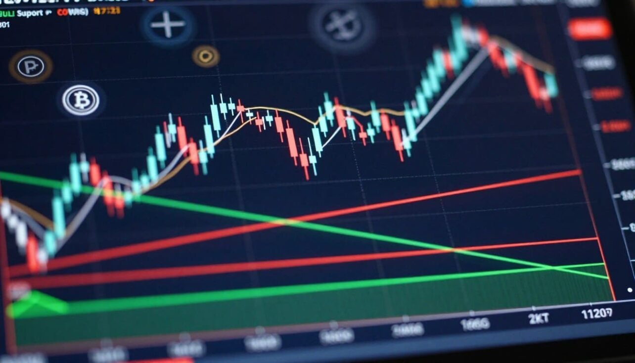
 and resistance (above) levels. The middle section features candlestick patterns, indicating fluctuations in price with vivid green (bullish) and red (bearish) candles. In the background, a subtle grid overlay suggests a digital trading environment, enhancing the technical analysis feel. The lighting should be bright and clear, reminiscent of a well-lit office space, with a slight focus effect to convey depth. The overall mood is professional and informative, suitable for illustrative purposes in a technical guide context.")
Demand areas where downtrends often pause
Demand zones form when selling pressure eases and buyers add orders near a common range. Price often pauses or bounces rather than moving straight through.
Supply areas where uptrends often stall
Supply zones come from profit-taking or new sell orders after rises. These areas cause rejections, consolidation, or short-term pullbacks.
Why zones matter more than single lines
Traders call them “levels,” but real markets trade across venues and show wicks. That makes a shaded zone more realistic than a single horizontal line.
- Reactions: bounces, rejections, or choppy testing tell you who has the edge.
- Validation: repeated tests strengthen a zone as more participants remember it.
- Action: use swing highs/lows to draw zones and plan entries near those areas.
For practical drawing tips, see this guide to drawing lines or this explanation of key zones.
Why support and resistance form in cryptocurrency markets
Collective memory—past pain, missed gains, and breakeven hunts—anchors actions to certain prices. Traders often return to the same spots after a loss or a near-miss. That shared memory creates visible areas on charts where many orders gather.

Trader psychology and “remembered” price points
Regret and relief shape behavior. People who sold too early or lost on a run will place trades near where that event happened. Over time, those repeats form a short-term market memory.
Order flow basics: buyers vs. sellers at key zones
Practical order flow looks like stacked buy or sell orders near perceived value. Large orders or clustered small orders create depth that defends a zone and makes it harder for prices to move through.
How volatility makes these areas more visible
Big swings and long wicks highlight where aggressive buying or selling appeared. Crypto’s volatility buries footprints fast, but it also makes reactions clearer when they happen.
Round numbers as psychological anchors
Clean numbers like $100,000 act as magnets. Many traders peg entries or exits to round points, which boosts liquidity and sharpens reactions at those numbers.
These forces leave readable footprints: swing highs and lows, repeated touches, and sharp rejections. Use those signs to find real price levels on your charts in the next section.
Support and Resistance Levels in Crypto: how to find them on charts
A practical scanning routine helps you spot durable price zones quickly.
A fast way to read any chart is to find past swing lows first—buyers often reappear there.
Marking swing lows to find support levels
Scan a higher timeframe and mark the clearest troughs where price stopped falling. These lows often show where demand surfaced before.
Marking swing highs to find resistance levels
Next, tag peaks where rallies stalled or reversed. Mark highs that had sharp rejections or multiple failed break attempts.

Using multiple “touching points” to confirm a level or zone
Confirm a zone when price reacts at least three separate times near the same area. Platforms that auto-detect will often require a minimum of three touching points for higher reliability.
How far back to look across timeframes for stronger areas
Prioritize zones that show up on 4h or daily charts, then refine on your entry timeframe (15m–1h). Go back to major consolidations, peaks, troughs, and high-volume turning points. Ignore minor noise to avoid clutter.
- Mark higher-timeframe zones first.
- Refine on the trading timeframe for precise lines.
- Use at least three touching points to grade strength.
Practical workflow: map big-picture zones, then use short-term charts to time entries so the larger trend guides risk and targets.
How to draw support and resistance zones the right way
Drawing clean zones starts with spotting the swing that mattered most on your chosen timeframe. Use that swing as the base for your marking and keep the chart uncluttered.

Horizontal lines versus shaded areas
When a single horizontal line works: use a line for tight ranges and clear reactions. A crisp rejection or bounce at nearly the same price makes a line sufficient.
When to use a shaded zone: choose a zone for wide wicks, messy consolidation, or multiple closing prices that cluster. Box the whole reaction band rather than forcing one number.
Wicks or closing prices to anchor to?
Use wicks to capture extremes during volatile moves. Use closing prices to show where traders accepted value at session end. Both methods matter; pick one and be consistent.
Validating strength and common mistakes
- Strength looks like repeated tests that hold and sharp bounces at the area.
- Avoid marking too many levels or ignoring higher timeframes.
- Don’t redraw a zone to fit the latest candle; that weakens decisions.
Polarity and breakouts: what happens when a level breaks
When price clears a major barrier, the market often repurposes that area as the first test on any pullback. This flip—where past rejection becomes a future floor or old support turns into a ceiling—helps traders plan entries and risk.
Practical polarity rule
Polarity means a broken resistance often acts as the first support on a retest. The reverse holds for breakdowns: a former support can cap rallies.
Mapping the next objective
After a confirmed breakout, map the next target by finding the next historical swing high (upside) or swing low (downside). For example, if Bitcoin clears the $94,000 resistance area, traders often look toward $100,000 as the next objective.
Why confirmation matters
Confirmation goes beyond a single wick. Look for multiple closes past the band, rising momentum, and volume that shows real participation. Beware of quick pierces, low-volume moves, and immediate reversals back into the prior range.
- Wait for break + retest + reaction before sizing positions.
- Use momentum and volume indicators to confirm participation.
- Place stop-loss near the invalidation point to control risk.
Indicators and tools that help identify support resistance
A handful of tools can separate useful zones from random price blips.
Moving averages act as dynamic barriers. A 200-day moving average often serves as a psychological guide because it updates with price and is watched by many traders.
Trend lines and channels give diagonal context. They work well when the market has a clear trend and horizontal markers feel distant.
Fibonacci retracement creates candidate zones for pullbacks. Use those points with price action to confirm likely reversal areas rather than treating them as final answers.
Candlestick signals show behavior at key price levels. Look for rejection wicks, strong engulfing candles, or repeated failure candles to read supply and demand near a zone.
Volume analysis reveals real interest. Spikes or sustained volume near a band suggest that the area will matter on future tests.
- Use multiple indicators together for confirmation.
- Validate candidate zones on higher-timeframe charts.
- Tools and screeners like altFINS can filter assets approaching or breaking support resistance and offer prebuilt setups to review.
How to use support and resistance in a crypto trading strategy
Using proven price bands to time buys and sells reduces guesswork and keeps risk manageable. This section shows how to plan entries, manage stops, and pick targets around visible areas on the chart.
Planning entries near support and exits near resistance
Approach trades buy as price nears a proven zone and take profits as price nears an upper band. Traders often lighten positions near a known barrier and add near a trusted floor.
Trading approaches versus breakouts
Range or mean-reversion: buy low inside the band, sell high at the top of the band. This suits quiet markets with clear swings.
Breakout: buy a clean close above a cap or sell after a confirmed breach below a floor. Wait for retest and volume to confirm.
Stops, targets, and risk-reward planning
Place stop-loss orders beyond the zone so a single wick doesn’t invalidate your idea. For longs, stop below the floor; for shorts, set it above the cap.
Target the next visible band for take-profit and consider scaling out as price approaches that area. Use risk-reward planning: only take trades where the reward comfortably exceeds the stop distance.
- Predefine entry, stop, and target before placing orders.
- Use nearby zones to calculate risk-reward ratios.
- Stay disciplined; avoid moving stops on impulse during choppy action.
Real-world crypto examples and current market context
Examples from live charts make rules easier to apply. Below are practical takes from recent action on Bitcoin and Ethereum and how traders map ranges and breakouts.
Bitcoin rejections near $94,000 show sellers defending that price band. Repeated failures to close above that area signal that buyers need clear momentum to push higher.
When a clean close does occur above that cap, traders often shift attention to the next round-number target near $100,000. If price instead stalls, BTC can trade sideways between a lower floor near $90K and an upper barrier around $108K.
Downside mapping: if the $90K floor breaks, watch for recovery attempts near the $78.5K 200 SMA and the next major floor around $75K as potential reaction points.
Ethereum double-barrier example: ETH facing a horizontal cap near $3,450 that aligns with the 200-day moving average often sees stronger rejections. When a moving average overlaps a horizontal band, the barrier typically holds unless volume confirms a breakout.
- Use these cases as templates: mark the zone, watch the test, require confirmation before trading a breakout.
- Note consolidation: a flat channel between lows and highs shows balance and favors range tactics until one side wins.
- Always check volume and trend context before sizing positions around any major point.
Conclusion
Reading repeated reaction bands gives traders a practical edge during volatile moves. Use zones rather than single lines; volatility, long wicks, and cross-venue pricing make areas more reliable for planning entries, exits, and stops.
Repeat a simple routine: mark swing highs and lows, confirm a zone with multiple touches, then validate on higher timeframes before you place a trade.
When a break occurs, expect polarity to flip roles; map the next historic band and wait for confirmation so you avoid false breakouts. Apply basic technical analysis rules to size risk, set targets logically, and keep favorable risk-reward while trading crypto markets.
Technical analysis helps decision-making; it does not remove risk. Use position sizing and strict risk controls every time.
FAQ
What do support and resistance mean in crypto technical analysis?
These are price areas where buying or selling pressure frequently appears. Demand zones tend to halt declines, while supply zones often cap advances. Traders use them to read likely turning points on charts rather than exact numbers.
Why are zones more useful than single lines on a cryptocurrency chart?
Crypto markets move with volatility and order clusters, so prices rarely stop at a single tick. Shaded zones account for wicks, spreads, and retests, giving a practical range for entries, exits, and stops.
How do trader psychology and remembered prices create these areas?
Market participants tend to place orders at psychologically important prices, like prior highs, lows, or round numbers. When many traders remember the same price, it becomes self-reinforcing as buyers or sellers act there again.
How should I mark swing lows and swing highs to find key levels?
Identify clear turning points where momentum reversed. Connect multiple swings at similar prices to form a zone. The more distinct touches across timeframes, the stronger the area typically is.
Which is better for drawing zones: wicks or closing prices?
Use both contextually. Wicks show where liquidity was chased and reveal stop runs, while closes reflect accepted market value. Anchoring zones to multiple criteria reduces false signals.
How many touches confirm a valid level or zone?
Two touches create a candidate level; three or more tests without a decisive break increase confidence. Also look for clustered volume or momentum shifts at those touches to validate strength.
How far back should I look across timeframes for stronger areas?
Check higher timeframes first—daily and weekly—because they represent more participants and larger order flow. Use lower timeframes for precision entries once a higher-timeframe zone is identified.
What is polarity and why does it matter after a breakout?
Polarity is when an area that acted as supply becomes demand after a successful breakout, or vice versa after a breakdown. Expect retests; a held retest confirms the flip and helps map the next target.
How do I map the next level after a breakout or breakdown?
Look to prior structural highs and lows, untested consolidation areas, and classic measured moves like range height projections or Fibonacci extensions to estimate the next meaningful price area.
Which indicators help identify these price zones quickly?
Moving averages provide dynamic support and resistance. Trend lines and channels add diagonal context. Fibonacci retracements, volume profiles, and candlestick signals also highlight probable reversal points.
How can volume improve my reading of price areas?
High volume near a level signals real participation and conviction. Low-volume tests are more likely to fail. Use volume spikes during breaks to judge whether a move has follow-through.
Should I trade bounces near levels or wait for breakouts?
Both are valid strategies. Bounces favor mean-reversion traders using tight risk controls. Breakouts suit momentum traders who wait for confirmation and volume to avoid false moves. Match the approach to your time horizon and risk tolerance.
How do I set stops and targets around these zones?
Place stops beyond the zone’s edge or slightly beyond recent extremes to avoid noise. Set targets at the next arm’s-length zone or use a risk-reward ratio that fits your plan—commonly 1:2 or higher.
What common mistakes should traders avoid when drawing levels?
Avoid treating single candles as definitive levels, ignoring higher timeframes, and overfitting lines to fit a narrative. Also resist changing levels after every minor retest; let price confirm or reject the area first.
How do moving averages act as dynamic support and resistance?
Popular averages like the 50, 100, and 200 periods are watched by many traders and funds. Price often reacts to these lines, making them useful for trend confirmation and as moving entry or exit references.
Can candlestick patterns at key areas improve trade decisions?
Yes. Reversal patterns such as pin bars, engulfing candles, or doji formations at significant zones increase the probability of a successful bounce or rejection when combined with volume and timeframe alignment.
How do consolidation ranges form between these areas and why trade them?
Ranges form when buyers and sellers reach temporary equilibrium. Trading within ranges allows for defined entries and exits near the edges, while breakouts from ranges often lead to larger directional moves.
Are round numbers important for setting orders in crypto?
Round numbers often act as psychological magnets where many traders place orders. They frequently coincide with supply or demand clusters, making them useful reference points for planning trades.
How do I use screeners and charting tools to automate zone detection?
Many platforms offer automated support and resistance detection, volume profile, and range scanners. Use them as a starting point, then manually inspect and adjust zones based on context and higher-timeframe alignment.
How do volatility and fast moves affect the reliability of these areas?
High volatility can cause false breaks and stop hunts, reducing reliability on short timeframes. Rely more on higher-timeframe zones and confirm with momentum and volume during volatile periods.
Can real-world examples like Bitcoin and Ethereum illustrate these concepts?
Yes. Major coins often show clear horizontal zones, moving-average confluences, and polarity flips. Studying recent Bitcoin rejections or Ethereum’s layered resistance teaches how zones interact with indicators and order flow.
No comments yet